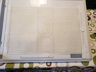
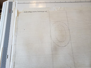
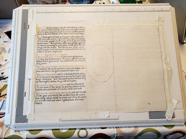
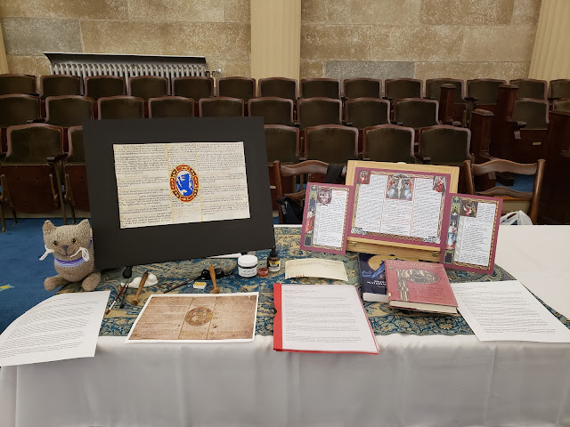
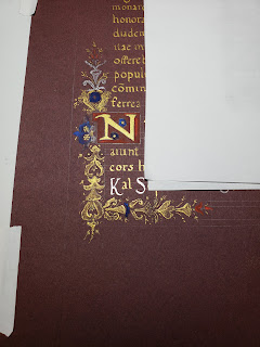
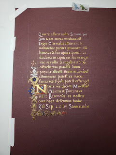
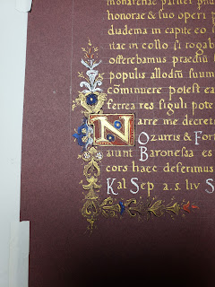
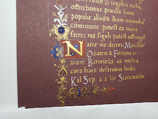
The next two posts are dedicated to my entry into the 2020 A&S Championship. This first post is the documentation of my entry to give people a background of what the project is and what I did for this.
~~~~
Recreation of a 16th Century Altar Card
Æsa feilinn Jossursdottir
29 February 2020
You, therefore, who with lofty spirit are fired with this ambition, and are about to enter the profession, begin by decking yourselves with this attire: Enthusiasm, Reverence, Obedience, and Constancy.
-Cennino d’Andrea Cennini, “Il Libro dell’Arte”
Summary:
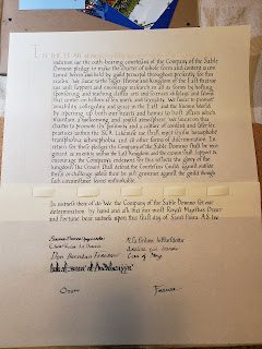
Recreation of a 16th century altar card, a memory aid for the officiant in a Catholic Mass, that has been adapted for use in the SCA as a court herald's memory aid. This project will explore calligraphy and illumination techniques unique to the extant piece and detail the scribal process used to recreate a modern version.
Background:
The altar cards came into use after the 22nd session of the Council of Trent held on Sept. 17, 1562 and implemented in the 1570s. They were used in the Tridentine or Traditional Latin Mass (TLM) until 1969 when the Roman Missal was implemented as part of the Second Vatican Council. The TLM was replaced with the Mass of Saint Paul VI (MSP), which used Ecclesiastical Latin and altar cards were no longer used.
Altar cards contain three sections, which are either separate pages or sections on a single page. They encompass distinct portions of the Mass and prayers, such as the offering of the host and consecration, the Credo, and the Last Gospel of St. John (1:1-14), which contains the closing of the Mass.
In 2007, Pope Benedict XVI allowed priests to offer both the old form of the Sunday Mass (the TLM) and the new form (the MSP) in an issued an Aposstolic letter given motu proprio. Reproductions of traditional 1950s and 1960s altar cards were issued for traditionalists to use in Sunday Mass, and can still be used today in place of the Ecclesiastical Latin for a Latin-language Mass.
Extant piece:
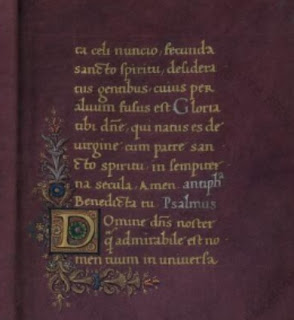
The source piece for this project was found online at the British Library catalogue of illuminated manuscripts (Additional 41996, f.128). It is an altar card created in the 16th century in Italy, when it was known as a tabella secretarum. The altar card has both ink and gold lettering throughout the manuscript. In the center section, there is a single large illuminated element. (fig.1)
The script used in the document is a Humanist calligraphy hand, with some details of note. The miniscule “a” appears to be a transitional letter that is somewhere between a typical Humanist “a” and one done in an Italic script. The letter lacks the slanted, small bowl and turned foot seen in typical Humanist script exemplars. Instead, it has a large, rounded bowl and the straighter foot of an Italic script. However, the “a” does not have the typical Italic letter slant. Also, the miniscule “i” has a dot above the main stroke of the letter. This element is rare in contemporary manuscripts, but it becomes more commonplace in Italic scripts.
The Latin text for this exemplar lacks standard Latin abbreviations seen in most religious texts. Suffixes such as -rum and -us are spelled out in words such as “seculorum” and “fidelibus”. Word such as “preclarum”, “propitiabile” and “permittas” demonstrate the lack of pre-, pro-, and per- prefix abbreviations respectively. The exemplar lacks ampersands and ligatures as well.
There is a distinct lack of margin space on the entire piece. The script stretches to the edge of the page on all sides. A contemporary altar card from France ca. 1515-1525 shows that the characteristics of the research piece are not ubiquitous for all altar cards. The altar card at the Morgan Library (MS M.1147) (fig. 2) and the sister page at the Free Library of Philadelphia (Lewis E M 43:21) (fig.3) both follow traditional layouts seen in 16th century Books of Hours (British Library, Harley 2924 f. 24v). There are detailed borders with depictions of key religious elements. The text inside the border has a typical illuminated capital, black script for a majority of the page and alternate colored text to highlight important elements. Contemporary Italian Book of Hours manuscripts and calendars (British Library, Yates Thompson 29) also have similar layouts and features, making this project’s example more unusual (fig 4). Another altar card dated to 1604 is laid out as a cartagloria, which is very similar to the triptych set-up of modern altar cards. (fig. 5) Again, this piece has a typical border and illuminated capitals seen in other contemporary pieces.
Materials:
- Goat skin parchment, sourced from Pergamena
- Oak gall ink (handmade by Mistress Adela Scrijver van Brugge of Meridies)
- H4 pencil
- Dr. Martin's Spectralite 18 carat Gold Liquid Acrylic Color
- Fine dental pumice/pounce
- Ames lettering guide
- #6 Mitchell calligraphy nib
- Speedball crow quill nib
- Ruler
- Penblade retractable knife
- Princeton synthetic sable brushes
Paints:
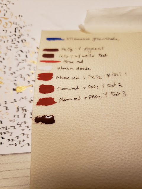
- Red iron oxide (handmade pigment by Baroness Marieta Charay)
- Schmincke gold watercolor
- Winsor Newton Ultramarine, Green shade
- Winsor Newton Permanent white (titanium oxide)
- Winsor Newton Ivory black (bone black)
- Winsor Newton Flame Red (toluidine red)
I chose to use oak gall ink, which was a common period ink. Walnut ink would be an acceptable choice to mimic the current, faded appearance. As the goal is to recreate this manuscript for a current application, I chose oak gall ink despite its darker color. I could also have chosen iron gall ink, but the exemplar does not show the pattern of corrosion associated with that material. When compared to an example such as Vat.lat.5533 (fig. 6) c.1574-1625, the pattern of damage in the altar card does not match.
Raised gold leaf after the 14th century declined in use and was typically found in Italian white vine manuscripts in the 15th century. During the 16th century most gold lettering and painting was commonly done using shell gold. Real shell gold, a suspension of powdered gold in gum arabic, can be thinned out and used in a similar manner to ink for calligraphy. I chose to use a modern equivalent of shell gold due to cost and my familiarity with it. The Spectralite ink is a suspension of 18 carat gold in an acrylic base that flows well in a modern nib. The gold is eye catching and surprisingly easy to work with.
My choice to use non-toxic gouache (and iron oxide) rather than period pigments (either commercially available or prepared by hand) was for mammalian safety. I have two very inquisitive tortoiseshell cats and a child under the age of two who all love to get into EVERYTHING they are not supposed to. I cannot guarantee against cross contamination of the non-toxic materials with toxic pigments. This is also why I used a modern nib and stylus rather than cut quills from reeds or feathers. Anything that could be confused for a cat toy, be dangerous for accidental ingestion, or be easily damaged was substituted for a safer (and less enticing) option.
Process:
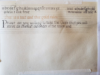
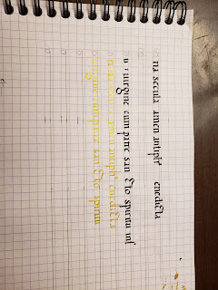
The first step in the calligraphy process was making a ductus of the script using the letter forms found in the exemplar (fig. 7). Not all of the modern day letters were available in the text (for example “j” or “k”). In these cases, I made up these letters using elements found in the extant piece. For some reason, I had a particularly hard time with the letter “h” and defaulted to a “Feilinn-standard Humanist ‘h’” in the practice pieces. Given a firm deadline for this project, I went with my subconsciously prefered “h” and moved on with my life.
The beginning rounds of calligraphy practice were done on bristol paper. Bristol has a bit more of a tooth to the paper than pergamenata, which would be good practice for writing on parchment. I started with large chiseled markers to get a feel for the letters and to call out sections where I was having difficulty with the letter shapes. Afterwards, I moved over to practicing with a nib and ink. I again started larger with a size #4 nib and move down to a smaller size #6.
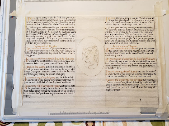
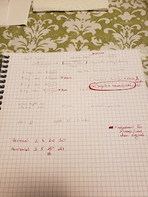
The dimensions of the extant piece are listed as 235 x 330mm or roughly 9.25 by 13 inches. I printed out a few copies of the source and used those to scale up the piece to 8.5 x 11in dimensions. From those measurements, I scaled the piece to both 1.2x and then to 1.1x scale. I ultimately settled on the 1.1x scale as it made for some easier math and would allow for the use of a #6 nib. Line spacing and characters per line at this scale were also calculated to make the recreated piece proportional to the original (fig. 8).
The time then came to start calligraphy practice on parchment. I used scraps of parchment donated from fellow scribes and a few pieces of goat parchment I had in my stash of scribal supplies.
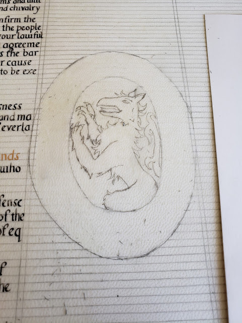
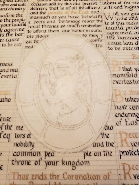
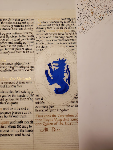
The next step was converting the center medallion from a religious depiction to something non-religious and SCA appropriate. I retained the same color scheme of red and blue with gold details for the outer oval of the illumination. Because the extant piece is in such bad shape in this section, the gold details of the illumination are indecipherable. For a substitute gold design, I used a contemporary illumination for inspiration (fig. 9). The center of the medallion was replaced with a blue tyger representing the populace of the East. I purposefully did not add the heraldry of the East as I did not want to make this recreation an “official” piece of East Kingdom court herald regalia. I opted to use the rampant tyger to fill out the shape of the medallion better.
A Memory Aid for the SCA:
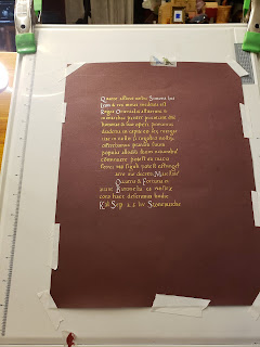
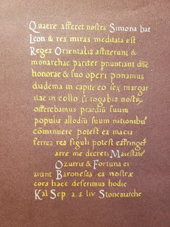
This recreation of an altar card was adapted to be a court herald’s memory aid. Removing the religious text and images was key to making this appropriate to the SCA. I decided to use a coronation, as there is usually a well-scripted ceremony. The Court Herald, Vox Regis, and heraldic staff would benefit from a memory aid or “cheat sheet” for the ceremony.
I chose the coronation ceremony for Edward II and Thyra I, as the text was readily available in an electronic format. The coronation ceremony was prepared and written by Master Steffan ap Kennydd of Silverwing. He did a great deal of research to compose a coronation ceremony that recreated period practices while being SCA-apporpriate and of sensible length. The text has been abridged, to approximate the length of the extant text.
Lessoned Learned:
This project combined many firsts in my scribal career. This was my first time using goat parchment and also using handmade period ink for calligraphy. The word count for the finished piece was 644 words which is considerably more words than I’ve done for a single project to date.
Calligraphy was done on the hair side of the parchment on the advice provided from Mistress Eva. I did two rounds of preparation on the parchment. The first was a full rubbing of pumice all over the parchment. The second was a light dusting of pumice after the lines were laid in pencil. I was careful to gently brush the pumice off the parchment as I didn’t want to accidently smudge or erase the pencil. After starting the calligraphy, my #6 nib bent after a paragraph of calligraphy. After borrowing another nib from a fellow scribe, I ordered 10 additional nibs in case this happened again.
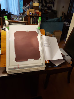
My lack of dedicated scribal space made for a few interesting challenges. There were a few near misses of cats landing near my supplies on the kitchen table as well as two artfully dodged ink explosions dangerously near the parchment. After each calligraphy or illumination session, my entire set up had to be taken down for the project’s own safety. I wasted a lot of time getting set up each session which could have been used for other tasks.
Acknowledgements:
Duchess Thyra Eiriksdottir for grammar help/editing, arithmetic assistance, and being my local scribal taskmaster (with tea).
Mistress Eva Woderose for help with workflow planning, acting as my sounding board for crazy ideas, and for generally being my scribal coach and cheerleader.
Master Gunðormr Dengir for help sourcing additional scribal documentation, editing, and unexpected tidbits of knowledge at all hours of the day.
Baron Sergei Rozvad syn for keeping all mammals under the age of four away from “Mommy’s scribal mess”.
Bibliography:
Pope Benedict XVI. SUMMORUM PONTIFICUM: ON THE USE OF THE ROMAN LITURGY
PRIOR TO THE REFORM OF 1970. 07 July 2007. <
https://w2.vatican.va/content/benedict-xvi/en/motu_proprio/documents/hf_ben-xvi_motu-proprio_20070707_summorum-pontificum.html>
Cennini, Cennino d’Andrea. Il Libro dell’Arte. Translation by Daniel V. Thompson Jr. New York: Dover Publications.1960
Clarke, Mark. Mediaeval Painters’ Material and Techniques: The Montpellier Liber diversarum arcium. London: Archetype Publishing Ltd. 2011
Waterworth, J. (1900) tr. The canons and decrees of the sacred and œcumenical Council of Trent : Celebrated under the sovereign pontiffs, Paul III, Julius III and Pius IV. Chicago, Ill.: The Christian Symbolic Publication Soc. <
https://history.hanover.edu/texts/trent/ct22.html>
Harris, David. The Art of Calligraphy: A Practical Guide to the Skills and Techniques. New York: DK Publishing Inc. 1995
O’Malley, John. “Trent and Vernacular Liturgy”. America Magazine - The Jesuit Review. New York: America Press Inc. 29 January 2007. <
https://www.americamagazine.org/issue/600/article/trent-and-vernacular-liturgy>
“Tridentine Mass”. British Broadcasting Corporation. 23 June 2009. <
http://www.bbc.co.uk/religion/religions/christianity/ritesrituals/tridentinemass_1.shtml>
Whitley, Kathleen P. The Gilded Page. New Castle: Oak Knoll Press. 2000.
Appendix:
Figure 1: Altar-card (tabella secretarum) executed for a nunnery (British Library, Additional 41996, f. 128)
Figure 2: Altar Card with the Deposition from the Cross (Free Library of Philadelphia, Lewis E M 43:21)
Figure 3: Altar Card (Morgan Library, MS M.1147)
Figure 4: Book of Hours, Use of Rome (the 'Hours of Bonaparte Ghislieri', formerly known as 'The Albani Hours') (British Library, Yates Thompson f. 29v and 30)
Figure 5: Illuminated manuscript on vellum, signed by Bernardo Anglesi of Pavia and dated 1604
(Bridwell Library, BRMS 122)
Figure 6: Example of iron gall corrosion on paper manuscript (Vatican Library, Vat.lat.6950 v18)
Figure 7: Ductus based on the exemplar
Figure 8: Scaling of the extant piece
Figure 9: Commission from Francesco Donato to Nicolò da Mula (British Library, Additional 20916, f. 8)

