Showing posts with label research. Show all posts

Thursday, August 27, 2020

Project: 16th c Altar Card - Part 2

Post number 2 about my A&S champ entry is documenting all the progress pictures and my creative process.

First thing's first.  In trying to recreate this piece, I had to get down to business with my least favorite part of the scribal process: arithmetic.  For scaling this piece, there was a balance of what would work for the amount of words I had and how large of a piece of parchment I would need.  With the assistance of Thyra, we settled on 1.2x scale of the original and have a boat load of notes on how we scaled it.  You can see a mix of my handwriting and Thyra's on this.  We both apparently have tiny handwriting.


I wanted to remain close to the original layout.  In editing down the coronation text, the ceremony for the sovereign and consort line up pretty well leaving the center text space for a "benediction" or in this case the end of the coronation ceremony.

The coolest (in my opinion) and most unique part of the layout is that the margins go all the way to the edge of the paper.  There is a 1/4" inch margin on the sides that needed to be cut after calligraphy was completed.


Test goat parchment for scaling and practice calligraphy


A quick interlude to show off the giant mess that is my workstation.  I had a stack of size 6 Mitchel nibs that I went through.  Also let's take a moment to talk about that bottle of gold ink.  That is a (sadly) discontinued bottle of Dr. Martin's Spectralite 18K gold I used as a substitute for shell gold.  It flows like a DREAM.  


Once all the calligraphy was done and the center tyger was sketched to my liking...it was time for paint! But first the tyger had a bit of a makeover going on.  He got SUPER FLOOFY, then less floofy, then pretty swole, then less so... well...you can see what the changes were on the next few pictures.


Before moving on to the rest of the colors, I did some text swatches on my piece of practice parchment.  There were a few iterations of the red color as I was trying to find a balance between earthy red and well...brown.


Above: take a look at the ink splotch hanging out on the right side.  Below: what ink splotch?  Turns out scraping/fixing mistakes on parchment is super easy.


Guidelines were erased and the last bit of trimming to the finished size...and.........poof!  The entire piece is DONE.

Below is my display for A&S Champs.  I'm pretty happy with it. :)


Tuesday, March 3, 2020

Project: 16th c Altar Card - Part 1

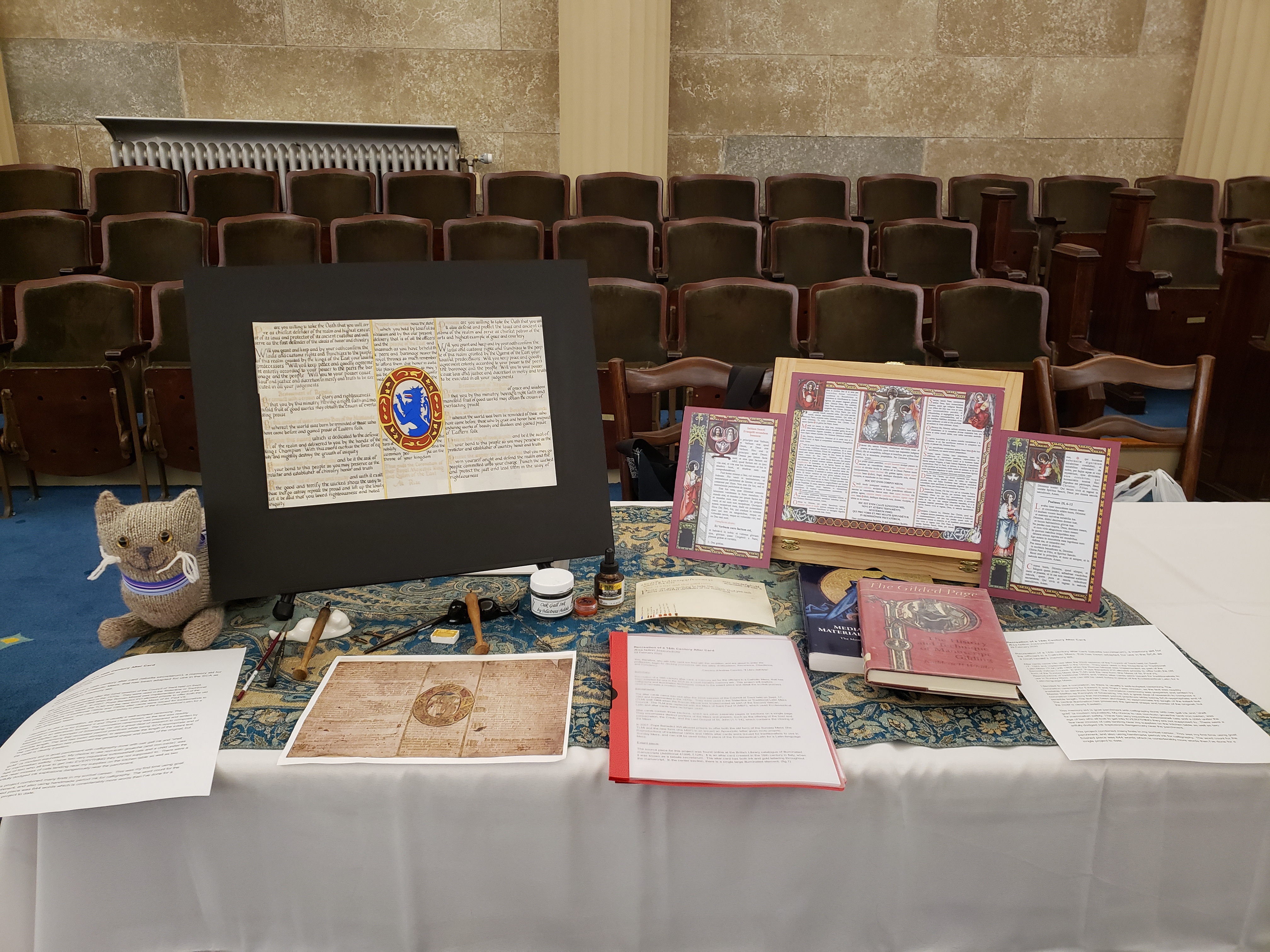
The next two posts are dedicated to my entry into the 2020 A&S Championship.  This first post is the documentation of my entry to give people a background of what the project is and what I did for this.

~~~~


Recreation of a 16th Century Altar Card


Æsa feilinn Jossursdottir


29 February 2020


You, therefore, who with lofty spirit are fired with this ambition, and are about to enter the profession, begin by decking yourselves with this attire: Enthusiasm, Reverence, Obedience, and Constancy.


-Cennino d’Andrea Cennini, “Il Libro dell’Arte”


Summary:


Recreation of a 16th century altar card, a memory aid for the officiant in a Catholic Mass, that has been adapted for use in the SCA as a court herald's memory aid. This project will explore calligraphy and illumination techniques unique to the extant piece and detail the scribal process used to recreate a modern version.


Background:

The altar cards came into use after the 22nd session of the Council of Trent held on Sept. 17, 1562 and implemented in the 1570s. They were used in the Tridentine or Traditional Latin Mass (TLM) until 1969 when the Roman Missal was implemented as part of the Second Vatican Council. The TLM was replaced with the Mass of Saint Paul VI (MSP), which used Ecclesiastical Latin and altar cards were no longer used.

Altar cards contain three sections, which are either separate pages or sections on a single page. They encompass distinct portions of the Mass and prayers, such as the offering of the host and consecration, the Credo, and the Last Gospel of St. John (1:1-14), which contains the closing of the Mass.

In 2007, Pope Benedict XVI allowed priests to offer both the old form of the Sunday Mass (the TLM) and the new form (the MSP) in an issued an Aposstolic letter given motu proprio. Reproductions of traditional 1950s and 1960s altar cards were issued for traditionalists to use in Sunday Mass, and can still be used today in place of the Ecclesiastical Latin for a Latin-language Mass.


Extant piece:

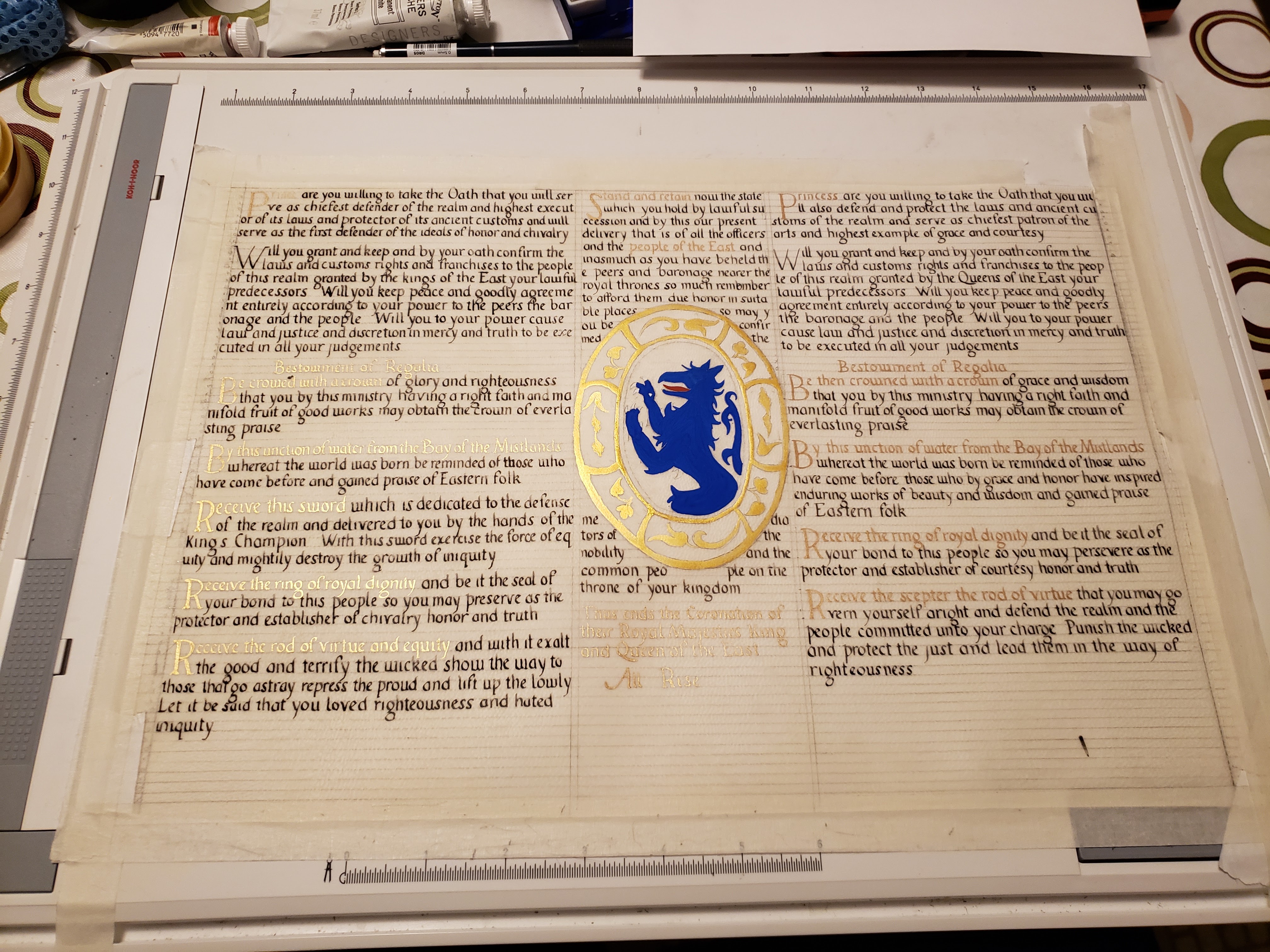
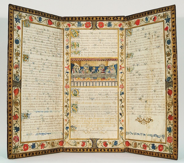
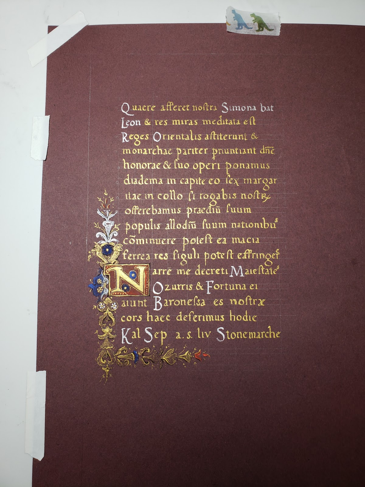
The source piece for this project was found online at the British Library catalogue of illuminated manuscripts (Additional 41996, f.128). It is an altar card created in the 16th century in Italy, when it was known as a tabella secretarum. The altar card has both ink and gold lettering throughout the manuscript. In the center section, there is a single large illuminated element. (fig.1)

The script used in the document is a Humanist calligraphy hand, with some details of note. The miniscule “a” appears to be a transitional letter that is somewhere between a typical Humanist “a” and one done in an Italic script. The letter lacks the slanted, small bowl and turned foot seen in typical Humanist script exemplars. Instead, it has a large, rounded bowl and the straighter foot of an Italic script. However, the “a” does not have the typical Italic letter slant. Also, the miniscule “i” has a dot above the main stroke of the letter. This element is rare in contemporary manuscripts, but it becomes more commonplace in Italic scripts.

The Latin text for this exemplar lacks standard Latin abbreviations seen in most religious texts. Suffixes such as -rum and -us are spelled out in words such as “seculorum” and “fidelibus”. Word such as “preclarum”, “propitiabile” and “permittas” demonstrate the lack of pre-, pro-, and per- prefix abbreviations respectively. The exemplar lacks ampersands and ligatures as well.

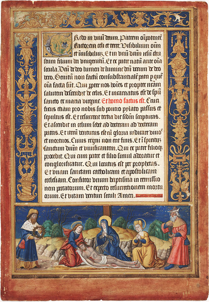
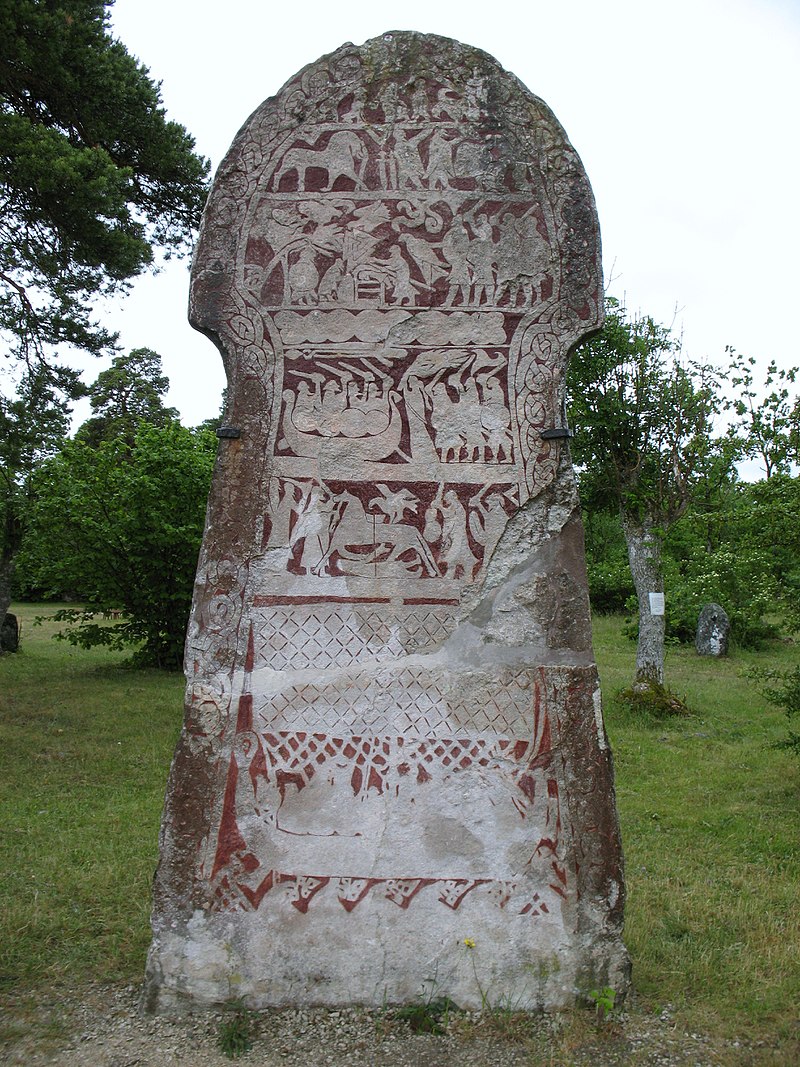
There is a distinct lack of margin space on the entire piece. The script stretches to the edge of the page on all sides. A contemporary altar card from France ca. 1515-1525 shows that the characteristics of the research piece are not ubiquitous for all altar cards. The altar card at the Morgan Library (MS M.1147) (fig. 2) and the sister page at the Free Library of Philadelphia (Lewis E M 43:21) (fig.3) both follow traditional layouts seen in 16th century Books of Hours (British Library, Harley 2924 f. 24v). There are detailed borders with depictions of key religious elements. The text inside the border has a typical illuminated capital, black script for a majority of the page and alternate colored text to highlight important elements. Contemporary Italian Book of Hours manuscripts and calendars (British Library, Yates Thompson 29) also have similar layouts and features, making this project’s example more unusual (fig 4). Another altar card dated to 1604 is laid out as a cartagloria, which is very similar to the triptych set-up of modern altar cards. (fig. 5) Again, this piece has a typical border and illuminated capitals seen in other contemporary pieces.


Materials:

  • Goat skin parchment, sourced from Pergamena
  • Oak gall ink (handmade by Mistress Adela Scrijver van Brugge of Meridies)
  • H4 pencil
  • Dr. Martin's Spectralite 18 carat Gold Liquid Acrylic Color
  • Fine dental pumice/pounce
  • Ames lettering guide
  • #6 Mitchell calligraphy nib
  • Speedball crow quill nib
  • Ruler
  • Penblade retractable knife
  • Princeton synthetic sable brushes

Paints:

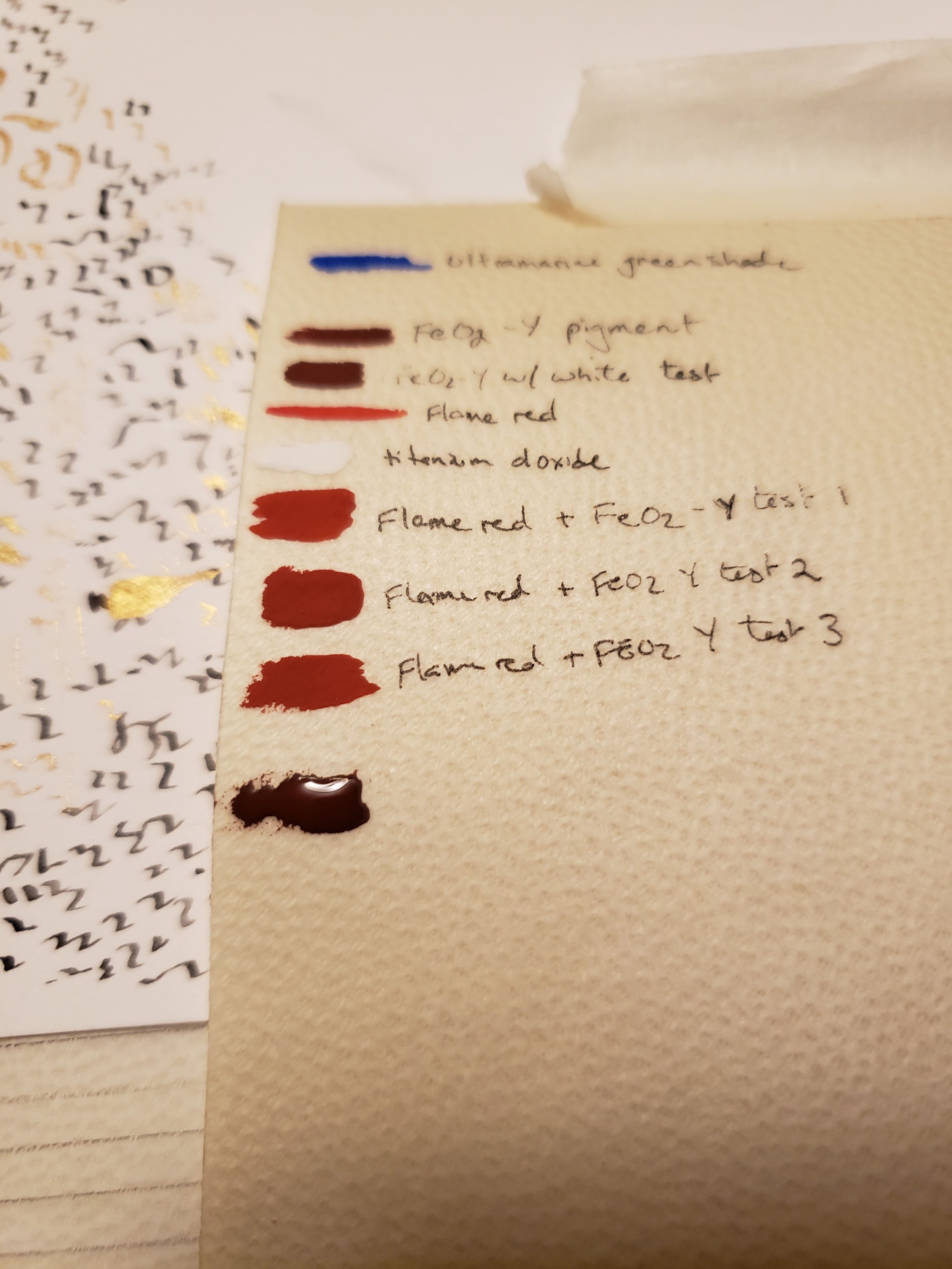
  • Red iron oxide (handmade pigment by Baroness Marieta Charay)
  • Schmincke gold watercolor
  • Winsor Newton Ultramarine, Green shade
  • Winsor Newton Permanent white (titanium oxide)
  • Winsor Newton Ivory black (bone black)
  • Winsor Newton Flame Red (toluidine red)

I chose to use oak gall ink, which was a common period ink. Walnut ink would be an acceptable choice to mimic the current, faded appearance. As the goal is to recreate this manuscript for a current application, I chose oak gall ink despite its darker color. I could also have chosen iron gall ink, but the exemplar does not show the pattern of corrosion associated with that material. When compared to an example such as Vat.lat.5533 (fig. 6) c.1574-1625, the pattern of damage in the altar card does not match.

Raised gold leaf after the 14th century declined in use and was typically found in Italian white vine manuscripts in the 15th century. During the 16th century most gold lettering and painting was commonly done using shell gold. Real shell gold, a suspension of powdered gold in gum arabic, can be thinned out and used in a similar manner to ink for calligraphy. I chose to use a modern equivalent of shell gold due to cost and my familiarity with it. The Spectralite ink is a suspension of 18 carat gold in an acrylic base that flows well in a modern nib. The gold is eye catching and surprisingly easy to work with.

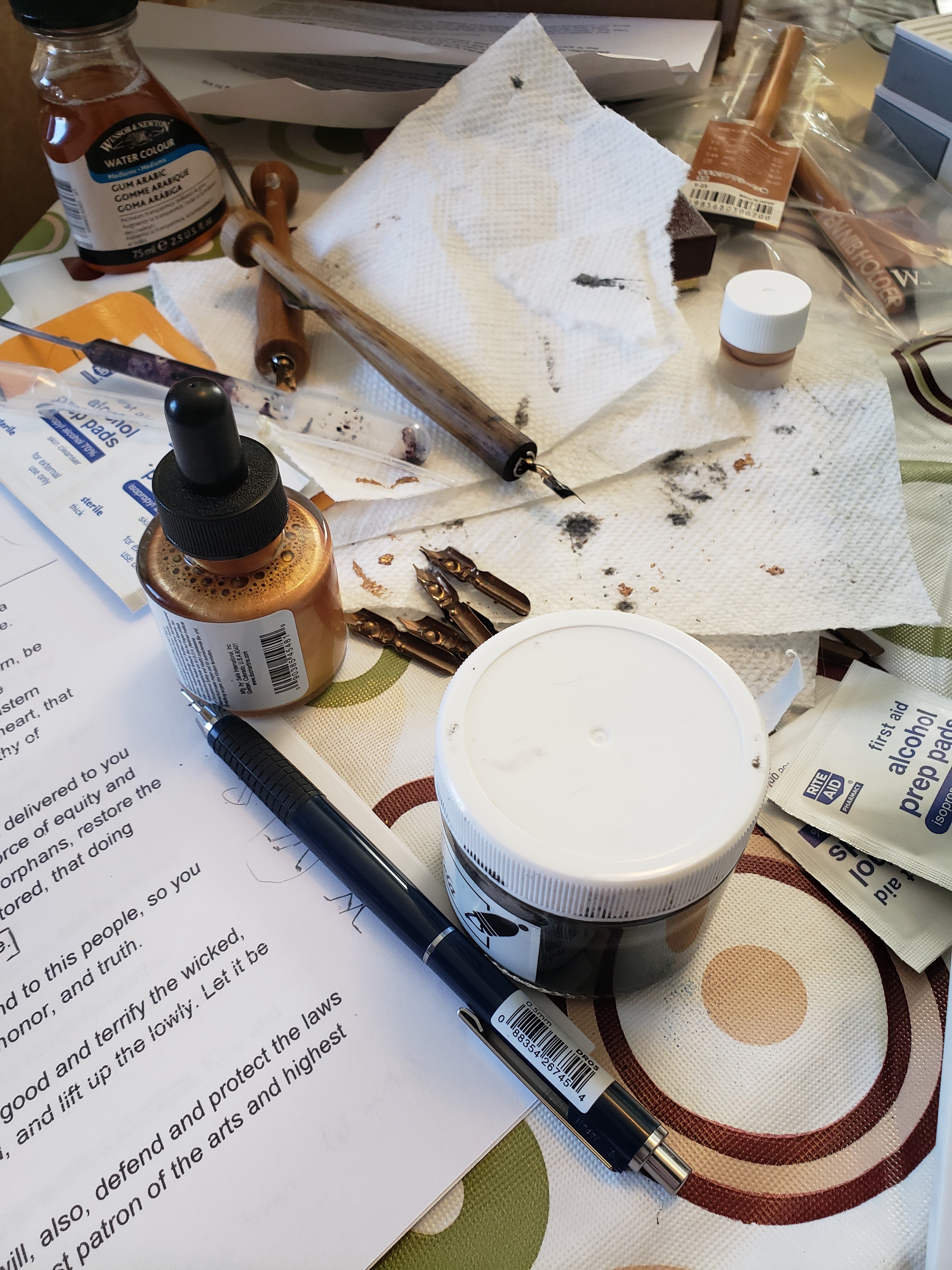
My choice to use non-toxic gouache (and iron oxide) rather than period pigments (either commercially available or prepared by hand) was for mammalian safety. I have two very inquisitive tortoiseshell cats and a child under the age of two who all love to get into EVERYTHING they are not supposed to. I cannot guarantee against cross contamination of the non-toxic materials with toxic pigments. This is also why I used a modern nib and stylus rather than cut quills from reeds or feathers. Anything that could be confused for a cat toy, be dangerous for accidental ingestion, or be easily damaged was substituted for a safer (and less enticing) option.


Process:

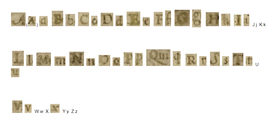
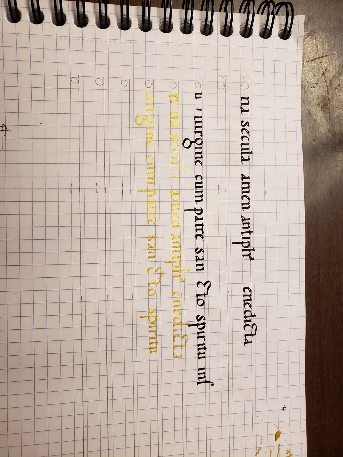
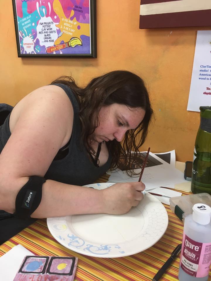
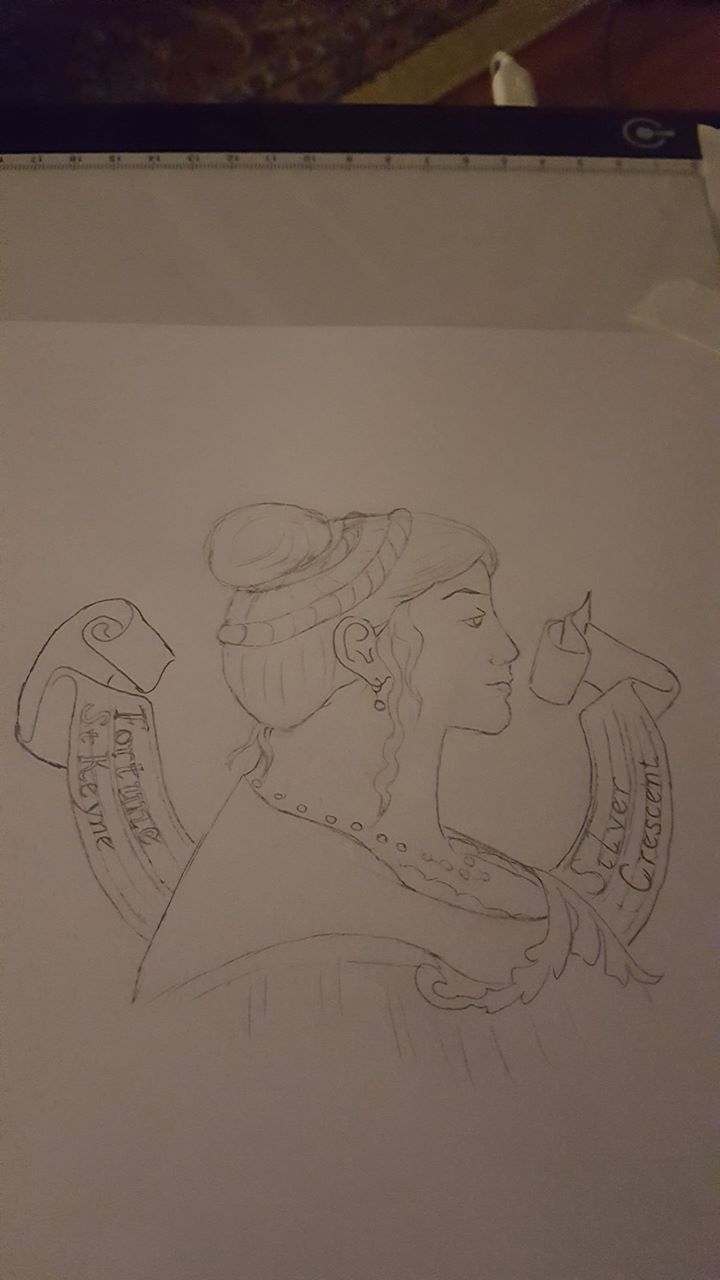
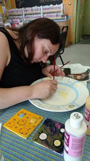
The first step in the calligraphy process was making a ductus of the script using the letter forms found in the exemplar (fig. 7). Not all of the modern day letters were available in the text (for example “j” or “k”). In these cases, I made up these letters using elements found in the extant piece. For some reason, I had a particularly hard time with the letter “h” and defaulted to a “Feilinn-standard Humanist ‘h’” in the practice pieces. Given a firm deadline for this project, I went with my subconsciously prefered “h” and moved on with my life.

The beginning rounds of calligraphy practice were done on bristol paper. Bristol has a bit more of a tooth to the paper than pergamenata, which would be good practice for writing on parchment. I started with large chiseled markers to get a feel for the letters and to call out sections where I was having difficulty with the letter shapes. Afterwards, I moved over to practicing with a nib and ink. I again started larger with a size #4 nib and move down to a smaller size #6.

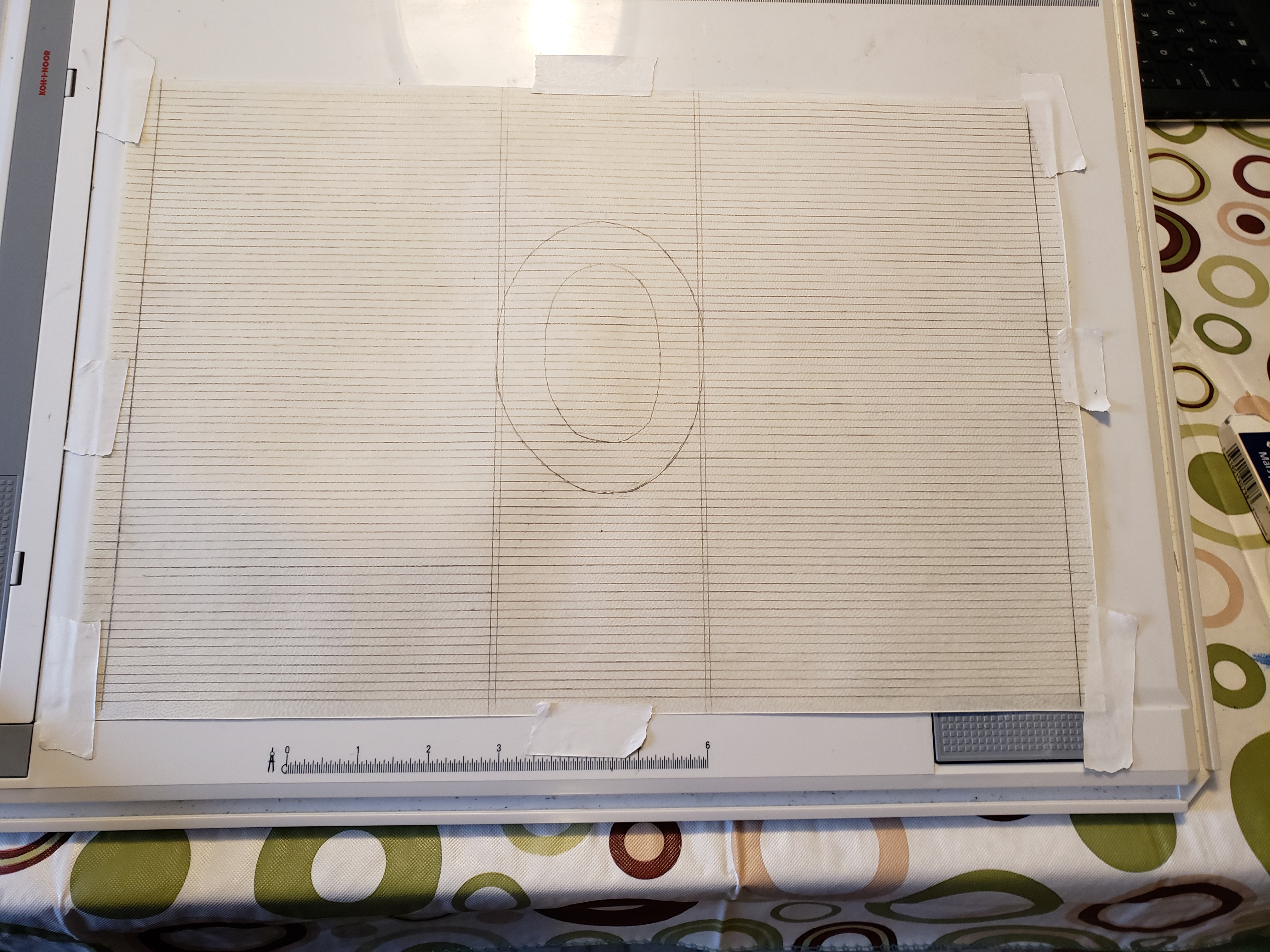
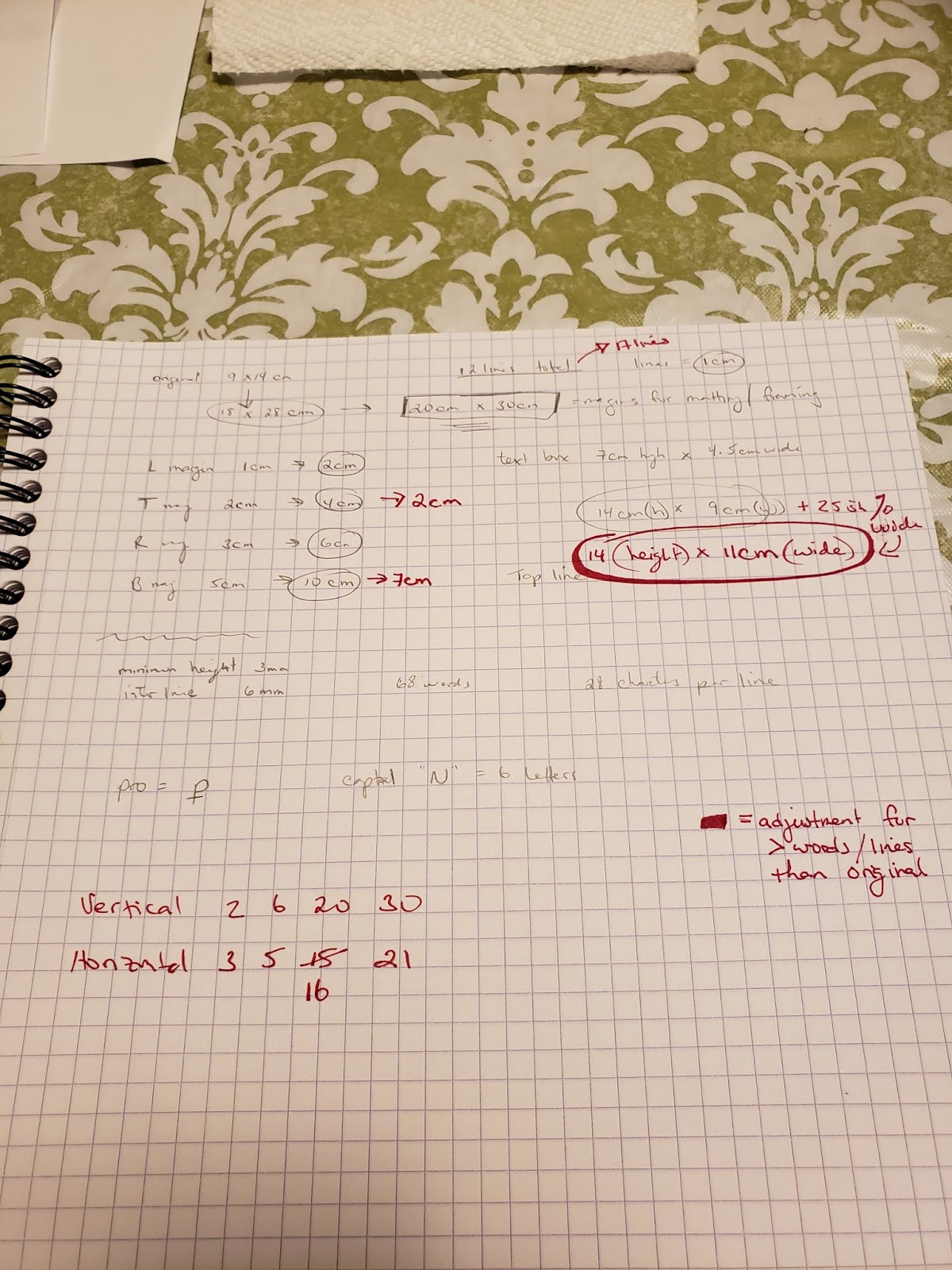
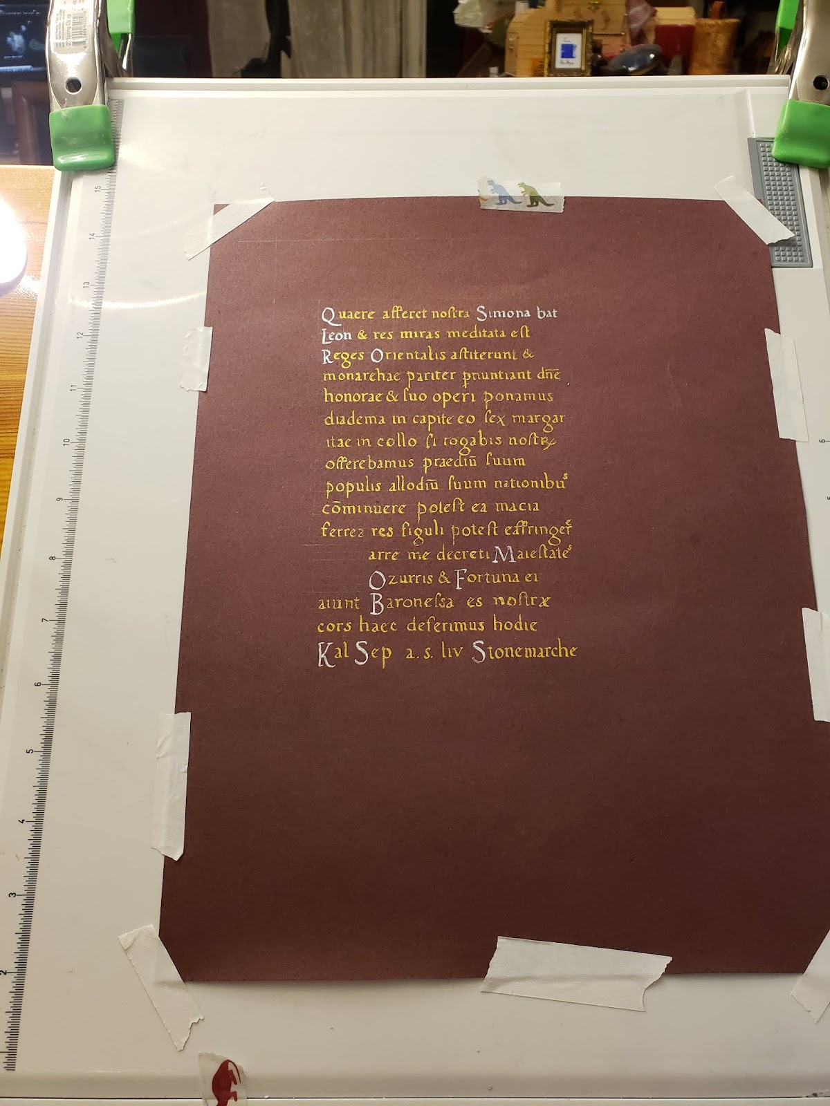
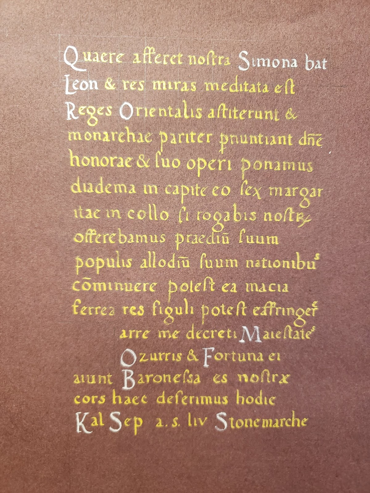
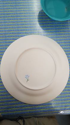
The dimensions of the extant piece are listed as 235 x 330mm or roughly 9.25 by 13 inches. I printed out a few copies of the source and used those to scale up the piece to 8.5 x 11in dimensions. From those measurements, I scaled the piece to both 1.2x and then to 1.1x scale. I ultimately settled on the 1.1x scale as it made for some easier math and would allow for the use of a #6 nib. Line spacing and characters per line at this scale were also calculated to make the recreated piece proportional to the original (fig. 8).

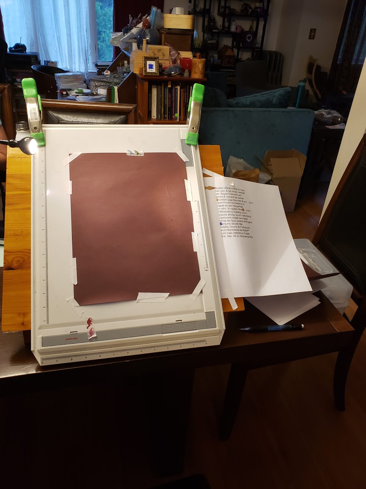
The time then came to start calligraphy practice on parchment. I used scraps of parchment donated from fellow scribes and a few pieces of goat parchment I had in my stash of scribal supplies.

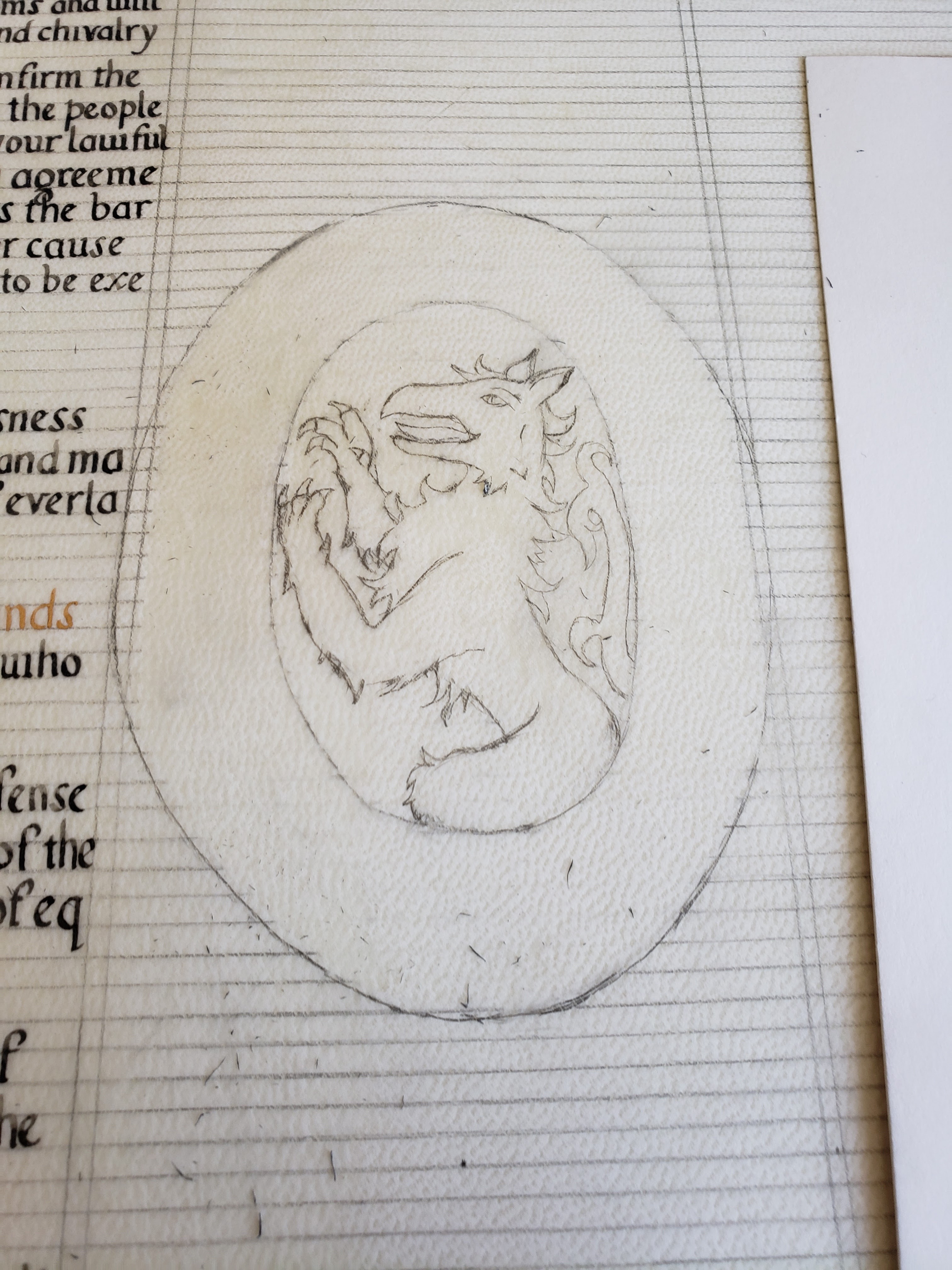
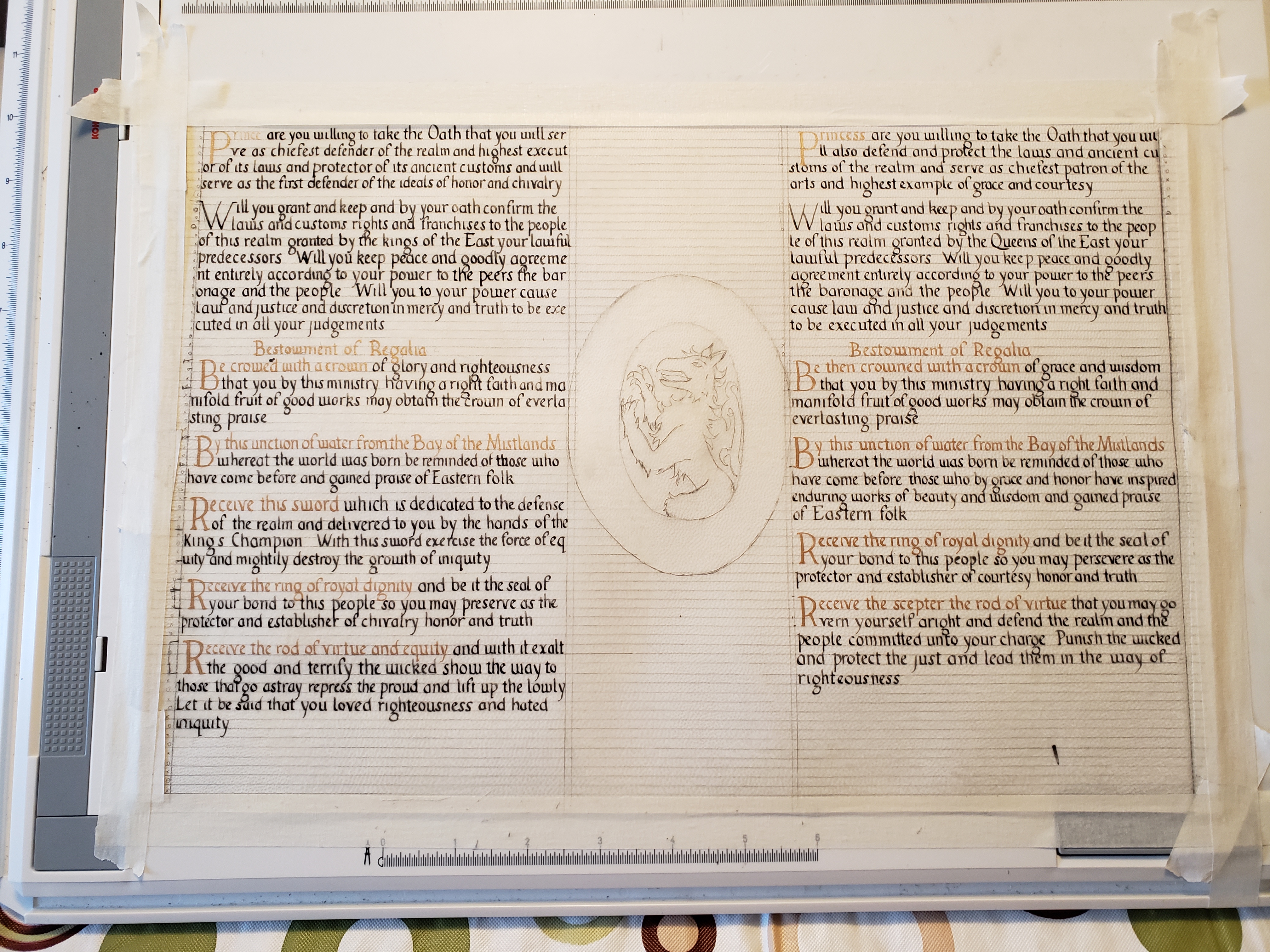
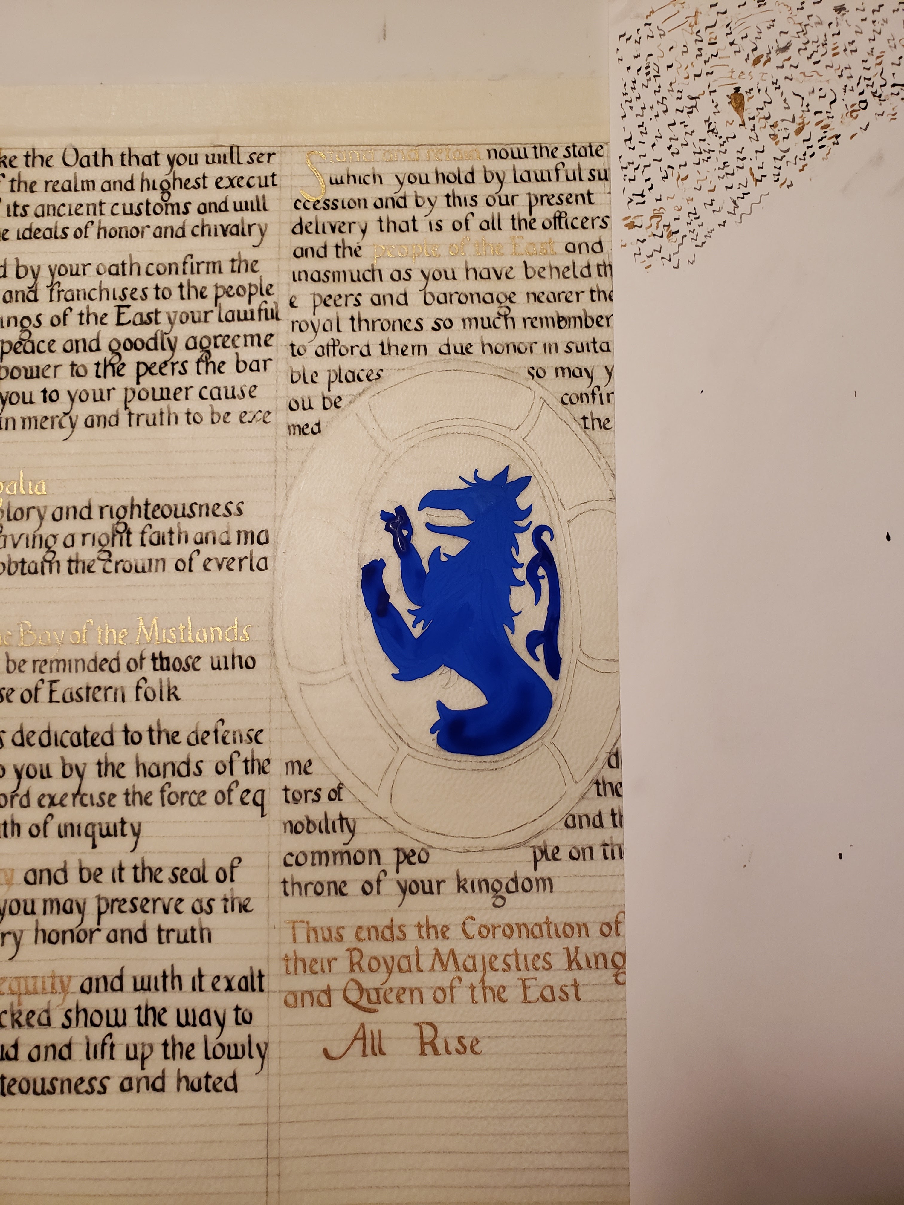
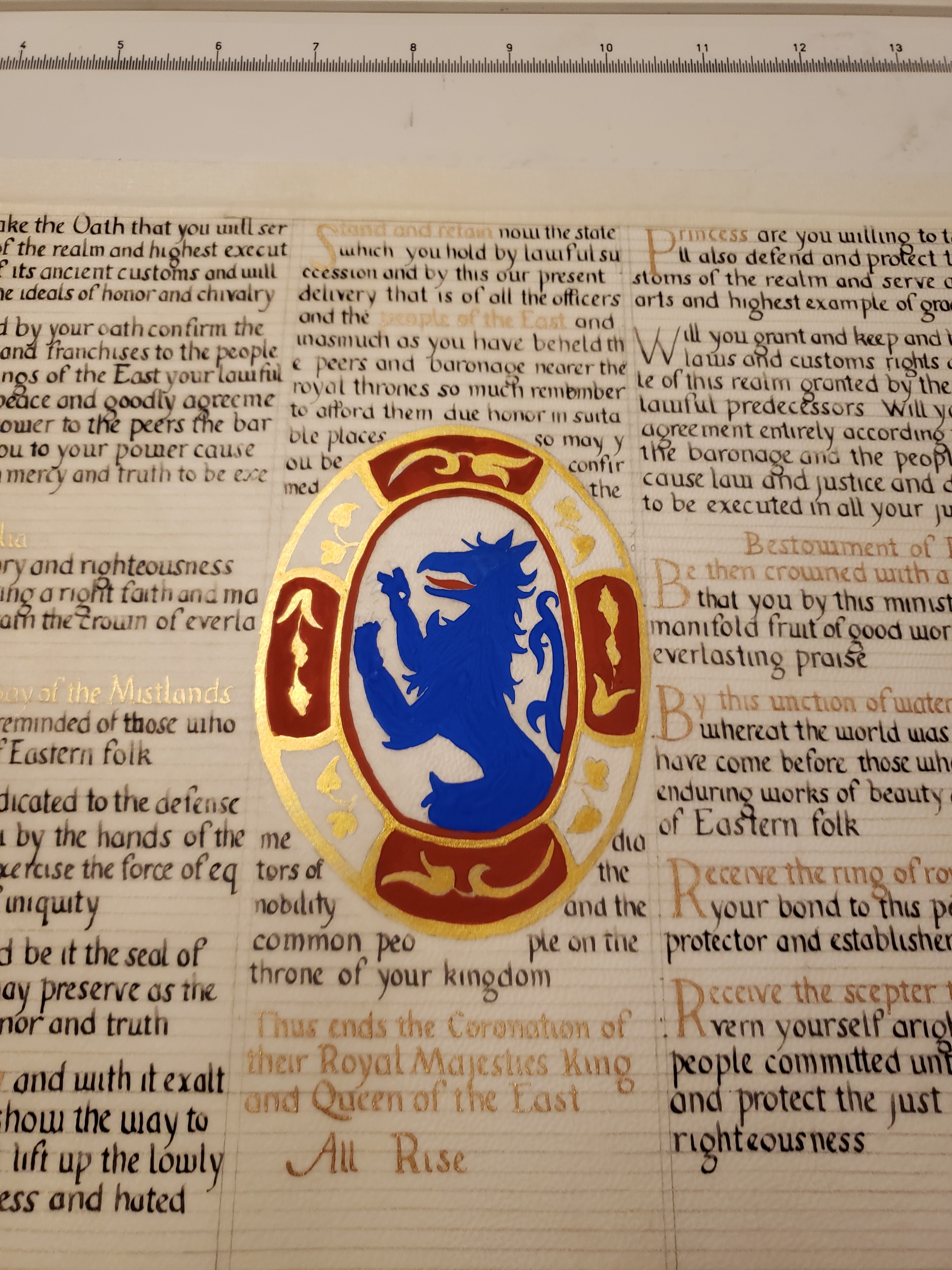
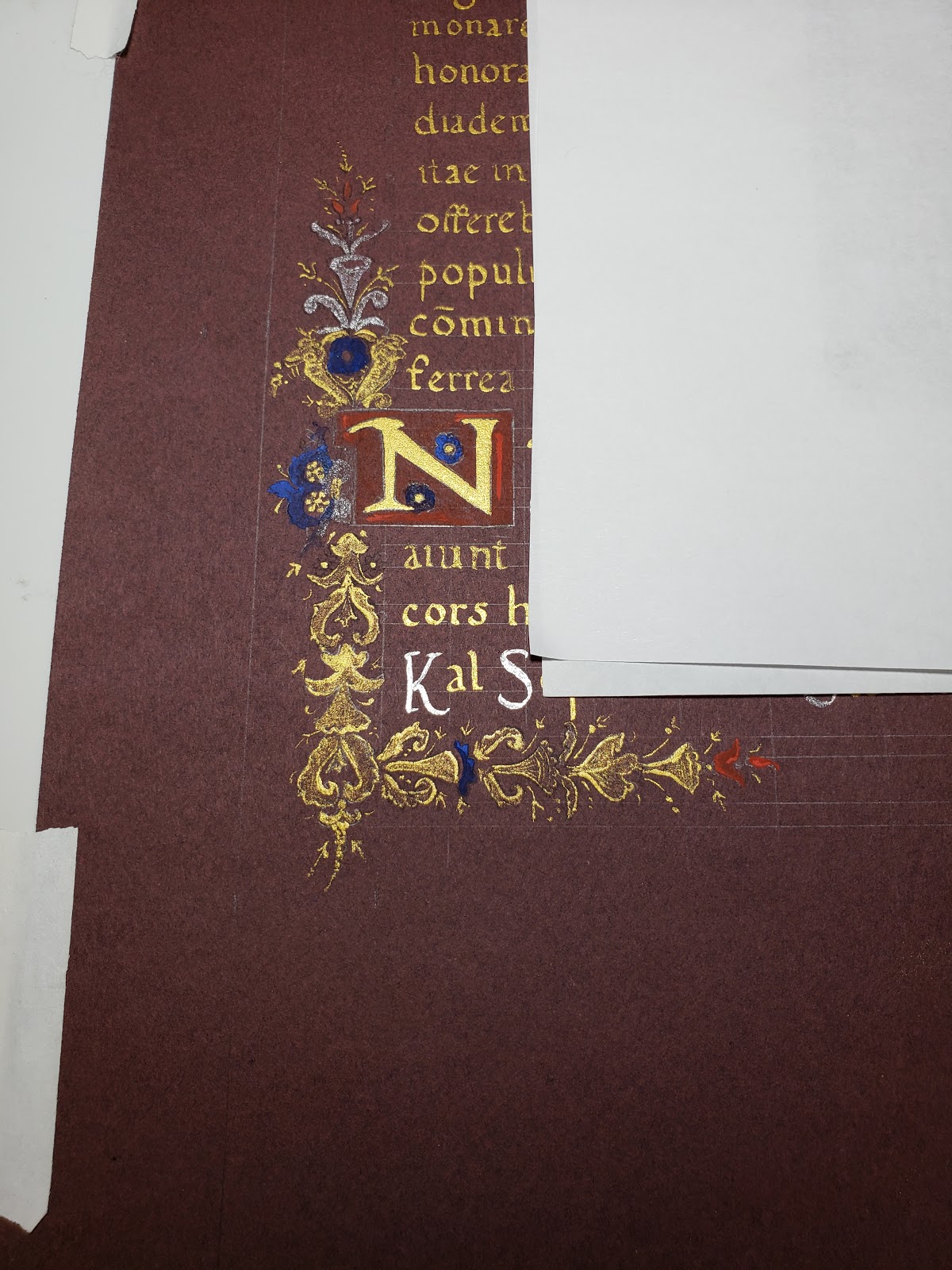
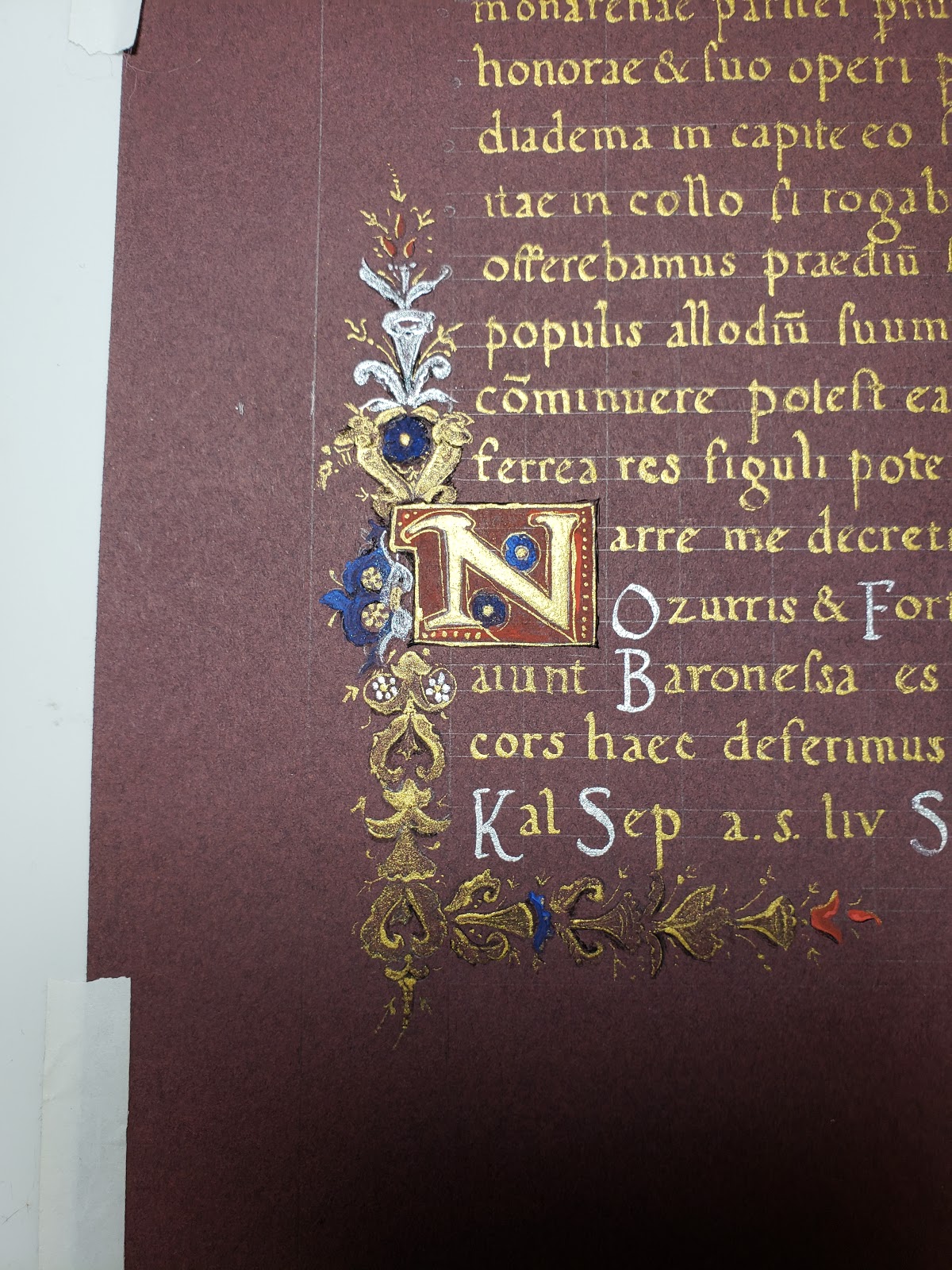
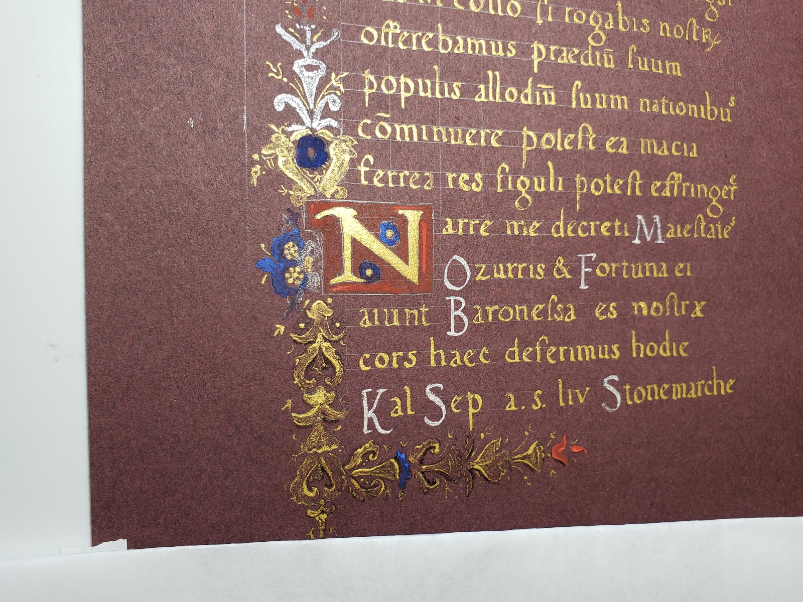
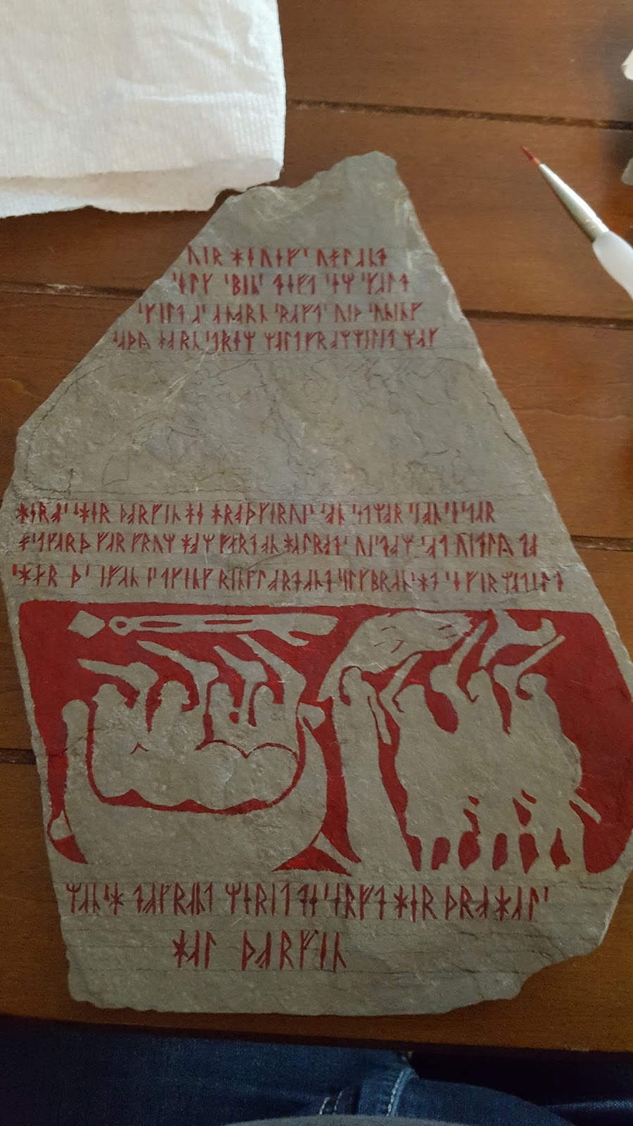
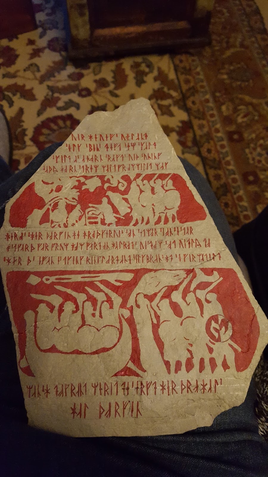
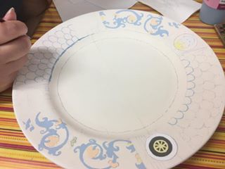
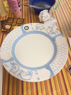
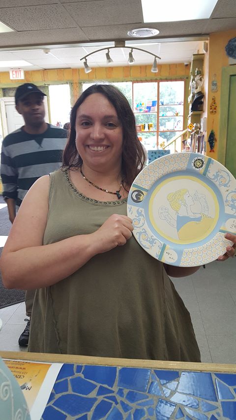
The next step was converting the center medallion from a religious depiction to something non-religious and SCA appropriate. I retained the same color scheme of red and blue with gold details for the outer oval of the illumination. Because the extant piece is in such bad shape in this section, the gold details of the illumination are indecipherable. For a substitute gold design, I used a contemporary illumination for inspiration (fig. 9). The center of the medallion was replaced with a blue tyger representing the populace of the East. I purposefully did not add the heraldry of the East as I did not want to make this recreation an “official” piece of East Kingdom court herald regalia. I opted to use the rampant tyger to fill out the shape of the medallion better.


A Memory Aid for the SCA:

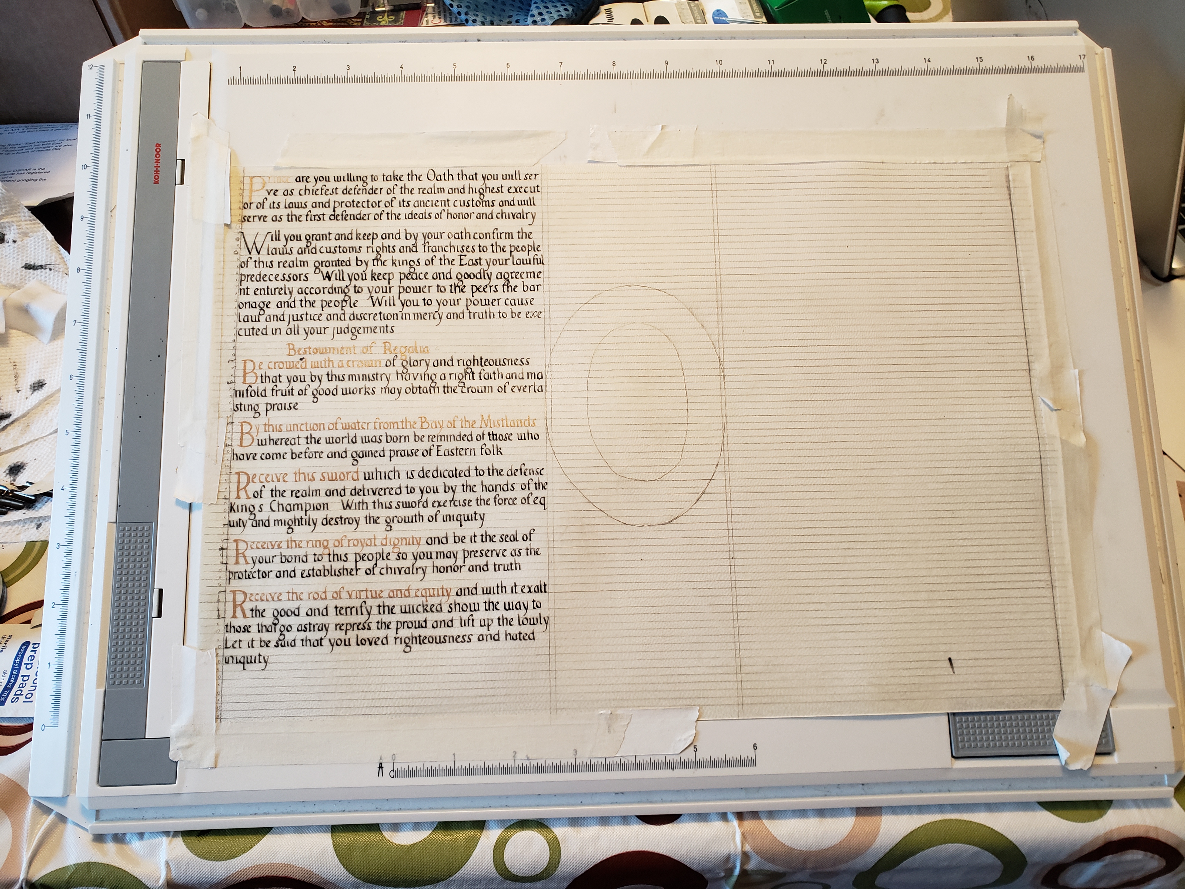
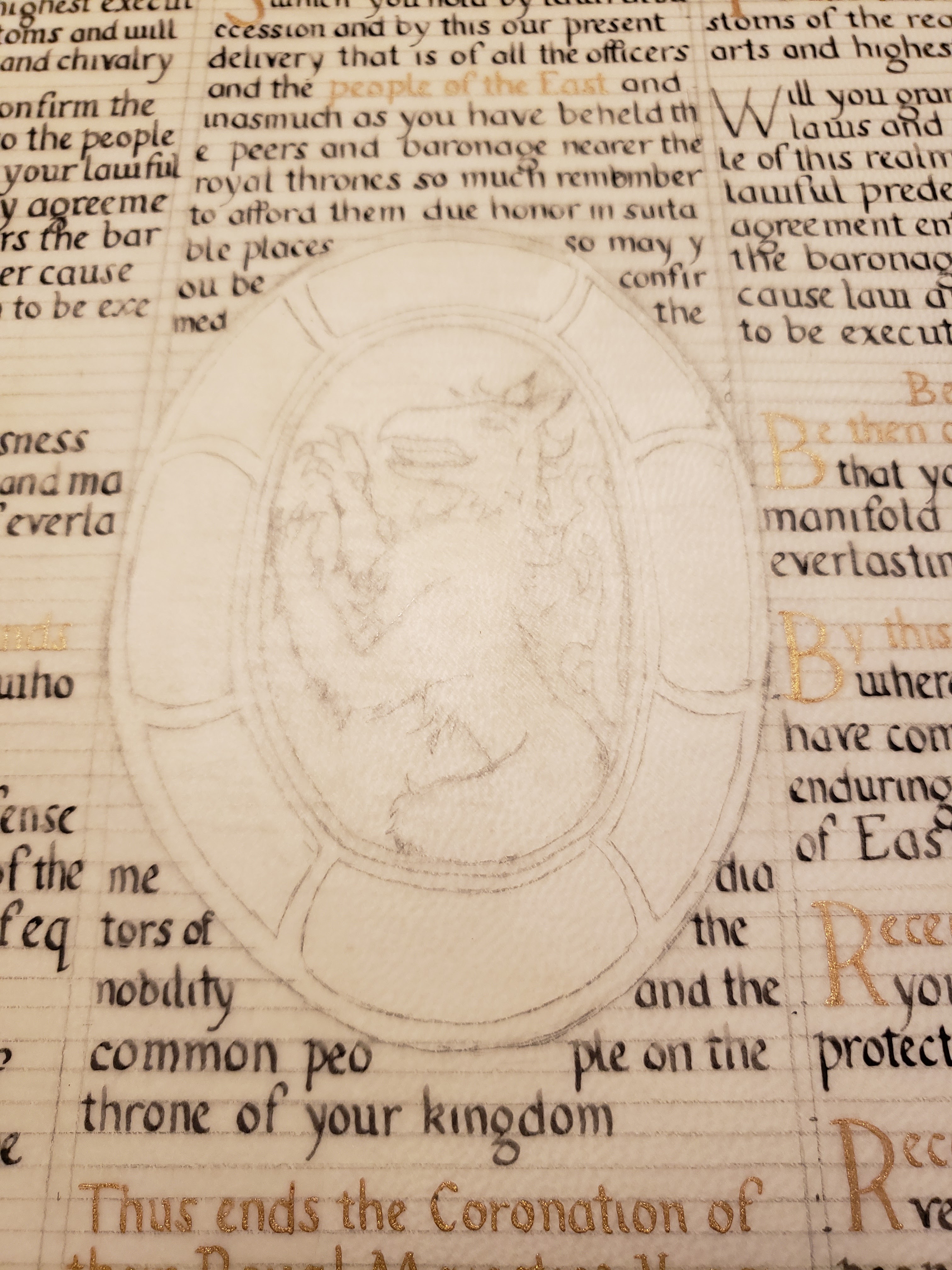
This recreation of an altar card was adapted to be a court herald’s memory aid. Removing the religious text and images was key to making this appropriate to the SCA. I decided to use a coronation, as there is usually a well-scripted ceremony. The Court Herald, Vox Regis, and heraldic staff would benefit from a memory aid or “cheat sheet” for the ceremony.

I chose the coronation ceremony for Edward II and Thyra I, as the text was readily available in an electronic format. The coronation ceremony was prepared and written by Master Steffan ap Kennydd of Silverwing. He did a great deal of research to compose a coronation ceremony that recreated period practices while being SCA-apporpriate and of sensible length. The text has been abridged, to approximate the length of the extant text.


Lessoned Learned:

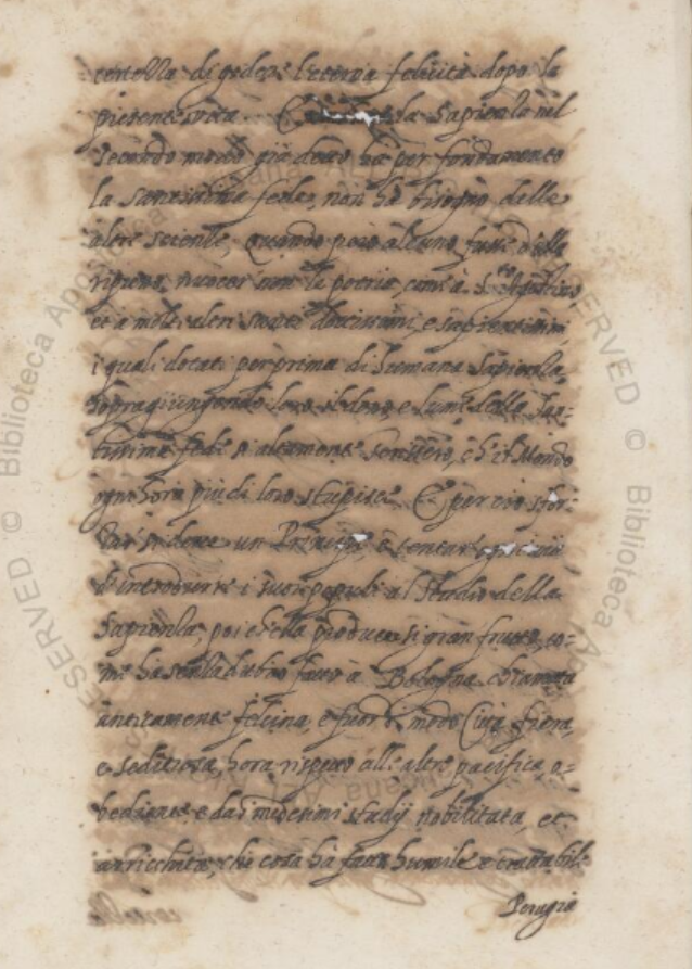
This project combined many firsts in my scribal career. This was my first time using goat parchment and also using handmade period ink for calligraphy. The word count for the finished piece was 644 words which is considerably more words than I’ve done for a single project to date.

Calligraphy was done on the hair side of the parchment on the advice provided from Mistress Eva. I did two rounds of preparation on the parchment. The first was a full rubbing of pumice all over the parchment. The second was a light dusting of pumice after the lines were laid in pencil. I was careful to gently brush the pumice off the parchment as I didn’t want to accidently smudge or erase the pencil. After starting the calligraphy, my #6 nib bent after a paragraph of calligraphy. After borrowing another nib from a fellow scribe, I ordered 10 additional nibs in case this happened again.

My lack of dedicated scribal space made for a few interesting challenges. There were a few near misses of cats landing near my supplies on the kitchen table as well as two artfully dodged ink explosions dangerously near the parchment. After each calligraphy or illumination session, my entire set up had to be taken down for the project’s own safety. I wasted a lot of time getting set up each session which could have been used for other tasks.
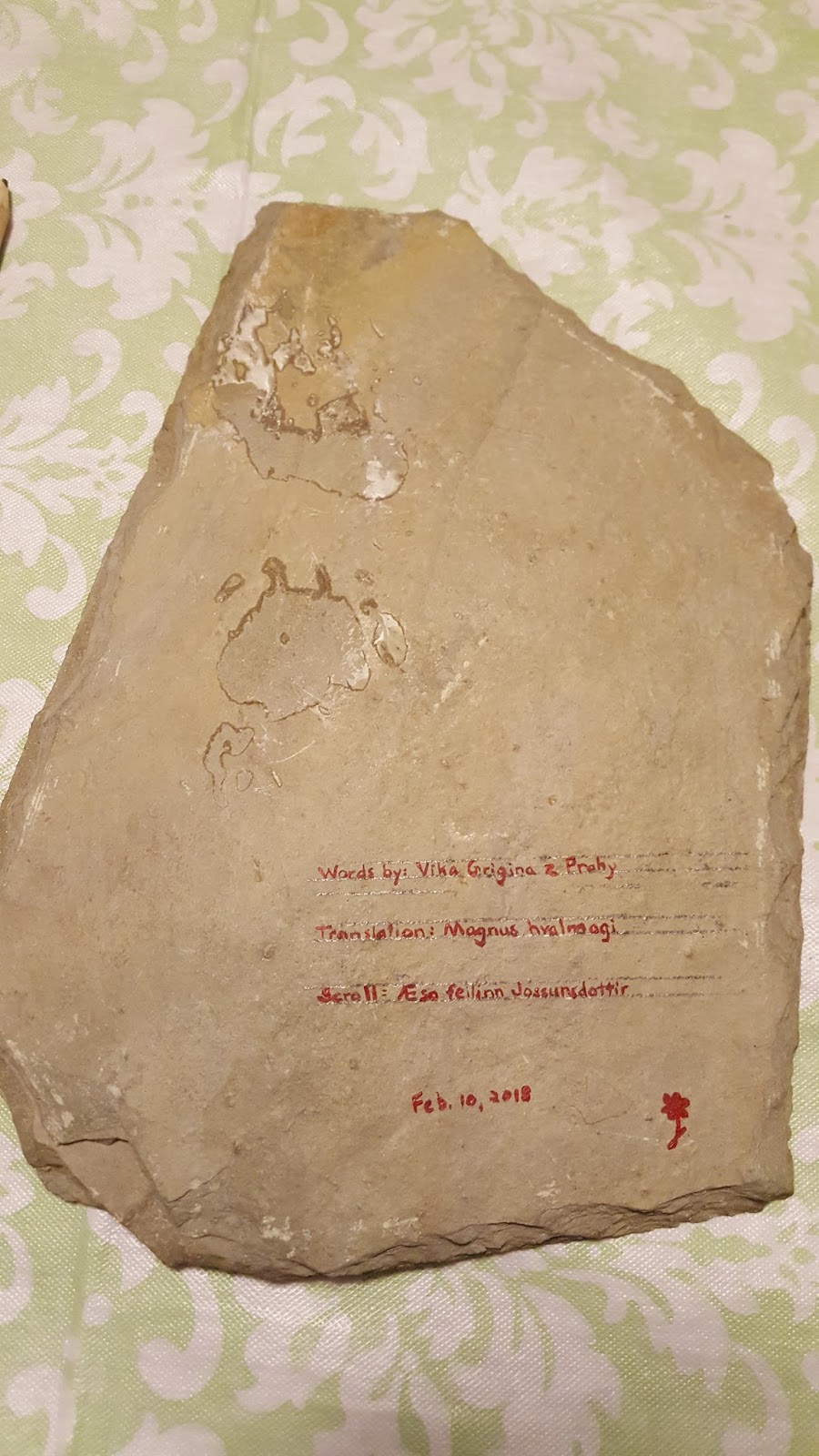

Acknowledgements:

Duchess Thyra Eiriksdottir for grammar help/editing, arithmetic assistance, and being my local scribal taskmaster (with tea).


Mistress Eva Woderose for help with workflow planning, acting as my sounding board for crazy ideas, and for generally being my scribal coach and cheerleader.


Master Gunðormr Dengir for help sourcing additional scribal documentation, editing, and unexpected tidbits of knowledge at all hours of the day.


Baron Sergei Rozvad syn for keeping all mammals under the age of four away from “Mommy’s scribal mess”.


Bibliography:

Pope Benedict XVI. SUMMORUM PONTIFICUM: ON THE USE OF THE ROMAN LITURGY


PRIOR TO THE REFORM OF 1970. 07 July 2007. <https://w2.vatican.va/content/benedict-xvi/en/motu_proprio/documents/hf_ben-xvi_motu-proprio_20070707_summorum-pontificum.html>


Cennini, Cennino d’Andrea. Il Libro dell’Arte. Translation by Daniel V. Thompson Jr. New York: Dover Publications.1960

Clarke, Mark. Mediaeval Painters’ Material and Techniques: The Montpellier Liber diversarum arcium. London: Archetype Publishing Ltd. 2011

Waterworth, J. (1900) tr. The canons and decrees of the sacred and œcumenical Council of Trent : Celebrated under the sovereign pontiffs, Paul III, Julius III and Pius IV. Chicago, Ill.: The Christian Symbolic Publication Soc. <https://history.hanover.edu/texts/trent/ct22.html>

Harris, David. The Art of Calligraphy: A Practical Guide to the Skills and Techniques. New York: DK Publishing Inc. 1995

O’Malley, John. “Trent and Vernacular Liturgy”. America Magazine - The Jesuit Review. New York: America Press Inc. 29 January 2007. <https://www.americamagazine.org/issue/600/article/trent-and-vernacular-liturgy>

“Tridentine Mass”. British Broadcasting Corporation. 23 June 2009. <http://www.bbc.co.uk/religion/religions/christianity/ritesrituals/tridentinemass_1.shtml>


Whitley, Kathleen P. The Gilded Page. New Castle: Oak Knoll Press. 2000.

Appendix:


Figure 1: Altar-card (tabella secretarum) executed for a nunnery (British Library, Additional 41996, f. 128)


Figure 2: Altar Card with the Deposition from the Cross (Free Library of Philadelphia, Lewis E M 43:21)


Figure 3:  Altar Card (Morgan Library, MS M.1147)

Figure 4: Book of Hours, Use of Rome (the 'Hours of Bonaparte Ghislieri', formerly known as 'The Albani Hours') (British Library, Yates Thompson f. 29v and 30)


Figure 5: Illuminated manuscript on vellum, signed by Bernardo Anglesi of Pavia and dated 1604
(Bridwell Library, BRMS 122)


Figure 6: Example of iron gall corrosion on paper manuscript (Vatican Library, Vat.lat.6950 v18)


Figure 7: Ductus based on the exemplar


Figure 8: Scaling of the extant piece 


Figure 9:   Commission from Francesco Donato to Nicolò da Mula (British Library, Additional 20916, f. 8)


Wednesday, September 18, 2019

Court Barony - Simona

I've been on a nominal scribal hiatus since the early fall when I was asked to be the award scheduler for Ozurr and Fortune.  I basically coordinate awards TRM would like to give out with the Signet and staff so I see ever single award that is going to go out.  This one came across my desk and I recalled a one-off comment from the recipient that she would eventually like a scroll from me.  I don't know why I remember these things, but I do.  I had a solid 3 months or so to get this done and of course I spend the majority of it on practice.

I'm going to work backwards a little bit and show you the piece Gun∂ormr brought up to me when he suggested I use it for the assignment.  I gave him the parameters of "later period Italian" with a "humanist hand".

This is considerably "more" than what I had been doing previously with my scrolls.

I said no.  Then I said no again.  And then the damn page wouldn't get out of my head and I went to my wise honest Laurel who said "Okay... so do it!".  So....I did it.

I spent most of the summer intermittently practicing a generic humanist and the humanist hand from my go-to source.  After getting home from Pennsic, both Eva and Thyra went over the specifics of the exemplar calligraphy to make my hand look more like the original.  Most noticeably, the A's were my stand out troublemakers.

The paper I used is a burgundy colored bristol equivalent that was purchased at Play Time in Arlington, MA.  I opted for two sheets of the paper in case I screwed anything up.  With Thyra's help, we scaled up my scroll to be double the original and worked out the line spacing.


This is hands down the most math I've done for a scroll.  Scroll side is doubled, then we accounted for the margins.
Spacing for the lines ended up being ~ 3.3mm for text and ~6.6mm for spacing.  The Latin text for the scroll was condensed down using Latin abbreviations (taught in Gun∂ormr's class at one of Quintavia's Scribal Moots) and the text was blocked out.  It's a few lines longer than the original but still looks proportional.

The Latin text was graciously provided by Gun∂ormr and Aelia Fortunata based on Psalm #2.

Scale practice text.  Top is using my normal Pelikan ink.  Bottom is watered down schmincke gold watercolor.
By this point I now have a good feel on the hand.  My condensed sexy looking text.  And one full week to try to get everything finished.  I called in the big guns and invited myself over Thyra's house and said please don't let me leave until I get the calligraphy done.  Everything was lined up, taped to my board, and completely in the wrong layout (landscape vs portrait).  Thyra's glee at breaking out the clamps was something I was not expecting.  See below...

Thyra: "Are you ready for Laurel-level solutions?"
Narrator:  Feilinn was in fact not prepared.

That's my drafting board clamped to Thyra's solid wood easel with my text taped to the side.  Some "Ikea magic" lighting rounded out the set up.

This is where my evening took a turn for the worse.  The thinned out gold FOUGHT ME the entire night.  The silver was really no better.  In all my practice runs it was fine, but nope! Not tonight.  I had Thyra do the silver S of Simona and the other capital S's and the capitol M.  I felt a little bit better when she reported back that the paint was fighting her too.  Honestly it was for the best I was "trapped" in a supportive environment instead of at home or I would have trashed the piece many times over which I couldn't afford to do.  The self imposed "I can't leave until the calligraphy us done" turned out to be the best thing I could have done.  By 11:30pm, calligraphy was all done.


One thing I hate and noticed later is that the left margin of my text bowed inward. Grrr. Next time.

Next came two solid days of illumination.  The first day was tracing the exemplar and trying to line up where the illuminated capital's box would be.  The Capital N was free-handed.  The border florals of the illumination were traced using a graphite transfer paper since the burgundy paper was too opaque to use a light box.  There was some fudging of the design to account for the longer text block as well.

The first coat of paint was a light and very thin gold or silver.  There were some spots where if you zoom in you can see I was a little impatient and there is some heavy handed shading initially.  The next night, I went back for another thicker layer of paint to add the depth to the metallics and added in the colors.  I chose to keep a simpler color pallet than the original to make it more cohesive.  I omited the green and changed that to the blue.  The blue here is all the same batch of watered down ultramarine green shade gouache even though some sections appear darker.

I was a jerk and sent a close up of the N to Simona with my hand rest paper over the text and asked her opinion.  She knew I was working on a CB because I had mentioned it and thought it was for another friend.
I am the biggest jerk. ;)

Recipient: Simona bat Leon
Award: Court Barony
Words and translation: Gunðormr Dengir and Aelia Fortunata so
Calligraphy and Illumination: Aesa feilinn Jossursdottir (me), guest capitals by Thyra Eiriksdottir
Materials: gouache, schminke watercolor, bristol (?)
Scroll source: Vatican Library Vat.lat.9490, folio 19r (https://digi.vatlib.it/view/MSS_Vat.lat.9490/0043)


Close up of the illumination so you can really see the shading.


Text:

Latin - 

Quaere afferet nostra Simona bat Leon, et res miras meditata est?

Reges Orientalis astiterunt, et monarchae pariter pronuntiant Dominae Honorae et suo operi

"Ponamus diadema in capite eo, sex margaritae in collo."

"Si rogabis Nostrum, Offerebamus praedium suum populis, allodium suum nationibus.

Comminuere potest ea macia ferrea, res figuli potest effringere"
Narrem me decreti: Maiestates Ozurris et Fortuna ei aiunt "Baronessa es Nostrae cors, haec deferimus hodie."
Kalends Septembribus Anno Sociatatis quinquaginta quattuor in Stonemarche

English-
Why does our Simona assemble the nations and plot wonderful things;

Rulers of the East take their stand and regents proclaim together for the Honorable Lady and for her works

“Let us put a coronet upon her head, six pearls upon her brow”

If you ask it of us, we will make your domain from the people, your estate from nations

You can smash them with an iron mace, shatter them like potter’s ware.”

Let me tell of the decree: Their majesties said to her “You are a baroness of our court, this we have granted you on the Kalends September AS 54 in our Barony of Stonemarche ”


Monday, February 12, 2018

Maunche - Thorfinr

The idea for this scroll came to me pretty quickly as soon as I read the write up for the recipient.  The curveball with this one was the recipient is a Norse persona studying Chinese brewing among other things.

My research into finding a runestone that had any type of brewing, led me to the Stora Hammars stones in Gotland, Sweden.  Two of the four stones are still legible and the third stone (Stira Hammars III) has an image of Odin stealing mead in the form of an eagle.  Through the creative process, I ended up only going with images from the Stora Hammar I since the images from Stora Hammar III weren't as clear.  The Norsemen on boats sailing around I thought were a good nod to the variety of talents the recipient had as well as the study of brewing in a far off local.

The big creative departure from the original stone to my piece was the addition of runes.  The Stora Hammars do not have any runes themselves.  I provided with some amazing words that deserved a place to shine on the finished piece, so I took some creative license and ran with it

Stora Hammars I


I went back to my old familiar friend Liquitex acrylic for the paints and found a lovely few pieces of slate at Home Depot which became the canvas for this.  What I likes about these patio tiles vs the slate square tile I'd previously used was the irregular shape of the stone itself.  It made it feel more like a mini-runestone.  A mock-up of the actual stone was made to figure out the rune/words spacing.  After I have already committed to using this particular stone, I realized how uneven it was in sections.  Lines for the runes were made with my drafting ruler and Ames lettering guide.  I tried a bulk transfer of the images using graphite paper (which did a terrible job, btw) and ended up faking it/free-handing WAAAAAY more than I actually planned to.  Much of the detail in the top panel was lost and much arting had to be done to make it look like the original.  The bottom panel was slightly better, but that's not saying much all things considered.

After some peer opinions from my scribal group, I went with the consensus to do this monochrome and fill in the background pieces with red.  There are some obvious mistakes made, but I think at this point I might be the only one who can pick them out.

Here are some progress pics:


Scissors included for scale.  The rock is ~9.5 inches tall, 6 or 7 inches wide.


The original sacrifice in the top panel has a blank space where there is a valknut in the original.  I had originally put the Maunche symbol here, but it was too small and almost unrecognizable. 

Tiny Maunche was not doing itself any favors here.  

I filled in the space and moved the Mauche to one of the shields of the warriors on the bottom panel.
The Maunche circle is the size of a dime. Also good to know I can still free-hand a Maunche symbol
 
I credit my free Ikea pencil (the one you get to write you item # and bin location) for being the toughest leaded pencil I own to show up nice and dark on the stone.  Both of my nice mechanical pencils failed for hard core editing of sketches in the rough sections.

I asked for and received permission from TRM to sign for them.  It turned out to be a good thing too, because the only space really left was the most uneven and terrible spot let on the whole stone (bottom right corner).  My pics were taken before I had received permission to sign for them, hence the lack of signatures.

Painting was done with one of my "loaner" size 0 round brushes, TRM signature (not shown) and credits on back were done with a 30/0 liner brush.  Yes, you can tell I used to paint a lot of miniatures. :)

Recipient: Thorfinr Hróðgeirsson
Award: Order of the Maunche
Materials: acrylic on slate (Cadmium Red Deep Hue Liquitex)
Words by Vika Grigina z Prahy
Rune translation by Magnus hvalmagi
C&I by me

Finished pic, minus TRM signatures.

Back of stone, credits given to the wordsmith and translator.  I added my artist mark and the date...oh and wrote my name because it's a thing I have been forgetting to do recently.


Thursday, July 13, 2017

Silver Crescent - Fortune, Part 2

Getting down to business...

I went with Simona to Claytime in Shrewsbury which is a paint your own pottery studio.  This place would be my base of operations for May and June....and is like five minutes from Fortune's house and a frequent hang out for her household.  If you did not think I was paranoid she would just burst in while I was in the middle of painting, you are wrong.

In our first visit, Simona and I wandered around looking for a plate with a nice, large edge and a shallow bowl.  I didn't find what I wanted.  We wandered around some more, chatted, and then we find one.  It's the only one in stock, wasn't too big, and looked like it would work.

Having only done paint your own pottery twice before, I needed to re-familiarize myself with how this process worked.  After picking a base coat of a light sand/ neutral color, I determined the brushes were not going to cut it for the detail work I needed to do.  Even the adult bushes (re: smaller than the gigantic ones the kids use) were not going to give me crisp lines and would make the portrait sheer hell to paint.  In this first visit, we finished the base coat and I added my marker's mark (a blue daisy) to the back over the price (in case that didn't burn off).  This was used for the identifier to the piece so I didn't have to write my name on it.  Turns out an identifier wouldn't even be needed, which I'll get to later.

Graphite pencils were a no-go for tracing.  Claytime cannot guarantee all of it will burn off in the kiln, so they suggest using felt tip markers.  The other valuable piece of information Simona was able to pull out of them was I could use watercolor pencils to draw on the place which would then be hidden.  I had no idea these even existed and of course Marieta came to my rescue with these.  Thyra also introduced me to chalk paper (instead of the graphite transfer paper I was planning on using) which let me sketch normally instead of making a mess on the plate itself.  This was INSTRUMENTAL in getting most of the designs on the plate itself.

I joke that I spent hours at Claytime, but I also spent a fair amount of time sketching at home, transferring the designs, and generally yelling at paper.  The other thing I did?  Layout design and measuring.  I have never done so much math and measuring for a scroll in my entire life! The layout I decided on relayed on the circles being radially symmetrical and their background sections with stripes to be proportional.  First this meant the entire lip edge of the plate had to be measured and marked off evenly.  I used a template for the circles and the border/wheel on Fortune's heraldry.  Everything marked off was done in watercolor pencil.

More measuring...more measuring....

I begin the sketching of the leaf and vine motif and I'm happy with it.  I go to transfer it to the plate and it's waaaaaay too small.  My solution was to repeat the vine pattern to fill up the space.  To me, this made it feel like the color had more to contrast to and struck a nice balance.  This also left me room for the tiny bee on the right panel.

It's at this point that I started to put the paint on the plate....

Embarrassingly, I had a flair up of pain from my lingering tennis elbow issue (hence the arm brace).  Good news - when you paint with friends, they can take progress pictures for you!
Claytime was enormously accommodating to my long painting sessions and spreading out on the table at points.  It turns out that when you're happy to share a table with other people (I'll get to that) and you behave like a normal human, they love you.  After each session, I took the plate home and thought about the next steps.

You can see the lines from the layout design.  These were all done in watercolor pencil (thin lines).  The thick lines are the first instances of the paint going on.  It looks like blue now, but it will darken once fired.

A few sessions in and I have some clear progress.  Most of the staff now knows about "the plate" and I have one regular gal on staff who knows me on sight.


So many lines to paint.....so many....
Most of the "easy" part is done.
And now we get to the part where I dreaded working on this...the protrait.  It's been said elsewhere in my blog that I hate drawing people.  I feel like a massive art-impostor trying to draw people because I cannot make them look right.  The amount of sketches I threw out that no one saw or that were drawn,had comments,hated, and then threw out are numerous.  Part of my problem was fear of the derp face (though it's period) and the other part was trying to blend a real like protrait style with the majolica style.  I ended up going with just a majolica portrait after receiving some wise and balanced input.

Sometimes you need to eat junk food and use your light table as a desk while watching  HGTV to be properly inspired.

The hair under went some revisions at the Quintavia Business meeting, but this was the most successful sketch.  I opted to do Fortune's hair uncovered as that's how she wears it to events usually and the bun is one of her signature styles for no-nonsense mischief.  Most of the plates depicted a veil or hat of some sort.  That idea was discarded after disastrous attempts of putting a coronet on previous sketches.  I used my light pad to traces the curly-queues of the banner because at this point it was 10pm and I had to go paint the next day.  The lettering hand on the banner is a humanist.  The portrait was transferred using chalk paper (my savior) and I was then good to go!

Take that, tennis elbow!  I'm mostly free of your sabotage!

Lookin' good!
The next steps were the tedious parts: the scales, the brush lining, and the signatures.  Remember when I said I would share a table with other people?  Yeah.  One session of painting I was at the end of a table near and aisle where one kid would constantly hit the back of my chair as they ran by.  (Child running in a pottery studio...think on that....)  The fifth or so time it happened, I think I actually swore because my brush skipped.  At that point, the dad of said free running child finally noticed what the kid was doing (because up until now he's been wrangling two other screaming terrors).  And lo, holy hell was reigned down on said child by their parent and many apologies were made.  I was actually more embarrassed and apologized for swearing.  The next session I was at, I sat with Captain Shakey-Table himself.  I kept my expletives to myself this time.

Boooyah!  This baby is DONE!!
Yeaaaaaaaaaaay!  I'm dooooooooone!

My artist mark.

My Claytime staff friend snapped this photo for me. :)
I may have said to the staff if it breaks in the kiln, I'll cry. 

Weeks pass and then I get this photo in a text message from Simona who went to go pick it up.
Dear god, I'm a lunatic for doing this....

But wait...there's more!  I decided this needed a scroll for the royals to sign the week before it was due (in between another scroll project and silk banner painting).

Eva wrote a lovely sonnet for this because she is amazing.

Calligraphy hand - Humanist by me
Words - Eva Woderose


Congrats, Fortune!  May you continue to smile upon Quintavia.

Special thanks to:

The ideas department: Simona bat Leon
Claytime painting company: Simona bat Leon, Marieta Charay
Sketch consultants: Nataliia Evganova, Eva Woderose, Thyra Eiriksdottir, Marieta Charay
Sounding board: Sergei Rozvad syn
Cheering section: House Strangewayes, Darostur, assorted members of Sharc and Lochleven