Showing posts with label OSC. Show all posts

Friday, January 8, 2021

Silver Crescent - Lilias

 Order of the Silver Crescent scroll for Lilias de Cheryngton

Scroll text by Gun∂ormr Dengir, Ælia Fortunata and Jerome of Stridon; based on the Song of Songs: http://www.drbo.org/drl/chapter/24001.htm 

Calligraphy and Illumination by Æsa feillinn Jossursdottir; based on Manuscript Vat.lat.9490 f.25v - Vatican Library


Finished scroll


Original, open folio view


Burgundy acid free paper, Dr. Ph. Martin's Spectralite 18 carat gold ink, goauche, schminke water color


Latin text:

Quae est ista quae progreditur quasi aurora consurgens, pulchra ut luna lunata, electa ut sol, terribilis ut castrorum acies ordinata?
Actiones illia columnae marmoreae quae fundatae sunt super bases aureas. Opera eia ut Atlantis, Mundus Cognitus sustinens.
Ea flos Orientis, illa Lilias Cheryngtonis.
Sicut lilium inter spinas, sic Domina nostrae inter Tygrides.
Sicut turris Orientis vis eia, quae aedificata est cum propugnaculis; mille clypei pendant ex ea, omnis bellatores fortium.
Si murus est, aedificemus super eam lunae argenteae;
si cimeliarchium est, ponamus corona Orientis in cautione sua.
Servicium eiae quam signum in Nostro Cordibus, quam signum in Nostra Armis, quia fortis est ut mors Noster Amor eiae.

in illo tempore, cum illis verbis fecerunt, in primo anno Suus Maiestates Tindale et Alberice consulibus, inter nubes candentes, exaltaverunt Liliatem Cheryngtonis ad Ordinem Selenarium Argenteum suo, ut hoc signum gerat, In pale a crescent inverted argent and an Eastern crown Or; simul ut potentias et responsabilitates ordini utatur in saecula saeculorum, vivat.


English text:

Who is she that cometh forth as the morning rising,
fair as the crescent moon, bright as the sun, terrible as an army set in array?
Her acts as pillars of marble, that are set upon bases of gold.
Her labors like Atlas, supporting the known world
She is the flower of the East, this Lillias of Cheryngton.
As the lily among the thorns, so is our Lady among the Tygers
Her Strength is the tower of the East, which is built with bulwarks;
a thousand bucklers hang upon it, all the armor of valiant warriors.
If she be a wall: let us decorate it with inverted crescents of silver
If she be a treasury, let us place an Eastern Crown within her care
Her service is as a seal upon Our Hearts,
as a seal upon Our Arms,
for Our Love for her is as strong as death

It was in those times and with those words that their majesties Tindal and Alberic, in the year of their first Counsulship did, amidst clouds of light, elevate Lillias of Cheryngton to their order of their silver crescent, that she might bear the mark, In pale a crescent inverted argent and an Eastern crown Or, and exercise the powers and responsibilities of that order for ever and ever, vivat

Wednesday, January 3, 2018

Silver Crescent - Sara

Another Silver Crescent with a quick turnaround needed.  The recipient had an Italian persona so I checked my store of print outs for one of my favorite Italian sources. 

I spent a good chunk of time on this doing the calligraphy practice.  The finished scroll is about 8"x10" since I got a little wordy and wanted to make sure I have the right amount of spacing between the lines.


Recipient: Sara Sala di Peruta
Award: Order of the Silver Crescent
Source: British Library - Yates Thompson 29 f.3
Illumination: gouache on pergamenata, Schmincke gold watercolor
Calligraphy: humanist


Side by side comparison to the original.


Remember kids, practice sometimes means making a giant mess but it's still practice.

Monday, September 18, 2017

Silver Crescent - Francesco

Another of my "wee scrolls" at 5'x7", this was a fun one if for no other reason that we had a ridiculous time working with Erhart von Stuttgart for wording. Finding words that "rhyme with speak" devolved into giggles during out weekly Scriptorium get together.  Because "on fleek" and "Mozambique" also rhyme with the target phrase. :)  He was a good sport who let us take his key words and run with it.

I'm particularly proud of the sketching on this.  I decided to include the peacock because of Her Majesty's heraldry.  I think he turned out pretty cute.

The hand I used for this was a humanist bookhand.  It's a little late for the source, but I didn't want to do a full on gothic script.  I had wanted to go a "proto-gothic" transitional but lost the source document for the script I liked.  My thought on this was humanist at least made it recognizable as an Italian source which was the key in picking this for the recipient's persona (even though the original is Italian with wording in Hebrew).

Recipient:  Barone Francesco Gaetano Gréco d’Edessa
Award: Order of the Silver Crescent
Source: British Library - Additional 11657 f. 27 and f.110v
Illumination: gouache on pergamenata, Schmincke gold watercolor
Calligraphy: Humanist. 

Side by side with the two originals.  The scroll became a blend of the two so I could include the peacock.

Finished scroll.  The outlining here is done and just needs signature lines.


Thursday, July 13, 2017

Silver Crescent - Fortune, Part 2

Getting down to business...

I went with Simona to Claytime in Shrewsbury which is a paint your own pottery studio.  This place would be my base of operations for May and June....and is like five minutes from Fortune's house and a frequent hang out for her household.  If you did not think I was paranoid she would just burst in while I was in the middle of painting, you are wrong.

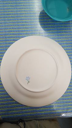
In our first visit, Simona and I wandered around looking for a plate with a nice, large edge and a shallow bowl.  I didn't find what I wanted.  We wandered around some more, chatted, and then we find one.  It's the only one in stock, wasn't too big, and looked like it would work.

Having only done paint your own pottery twice before, I needed to re-familiarize myself with how this process worked.  After picking a base coat of a light sand/ neutral color, I determined the brushes were not going to cut it for the detail work I needed to do.  Even the adult bushes (re: smaller than the gigantic ones the kids use) were not going to give me crisp lines and would make the portrait sheer hell to paint.  In this first visit, we finished the base coat and I added my marker's mark (a blue daisy) to the back over the price (in case that didn't burn off).  This was used for the identifier to the piece so I didn't have to write my name on it.  Turns out an identifier wouldn't even be needed, which I'll get to later.

Graphite pencils were a no-go for tracing.  Claytime cannot guarantee all of it will burn off in the kiln, so they suggest using felt tip markers.  The other valuable piece of information Simona was able to pull out of them was I could use watercolor pencils to draw on the place which would then be hidden.  I had no idea these even existed and of course Marieta came to my rescue with these.  Thyra also introduced me to chalk paper (instead of the graphite transfer paper I was planning on using) which let me sketch normally instead of making a mess on the plate itself.  This was INSTRUMENTAL in getting most of the designs on the plate itself.

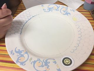
I joke that I spent hours at Claytime, but I also spent a fair amount of time sketching at home, transferring the designs, and generally yelling at paper.  The other thing I did?  Layout design and measuring.  I have never done so much math and measuring for a scroll in my entire life! The layout I decided on relayed on the circles being radially symmetrical and their background sections with stripes to be proportional.  First this meant the entire lip edge of the plate had to be measured and marked off evenly.  I used a template for the circles and the border/wheel on Fortune's heraldry.  Everything marked off was done in watercolor pencil.

More measuring...more measuring....

I begin the sketching of the leaf and vine motif and I'm happy with it.  I go to transfer it to the plate and it's waaaaaay too small.  My solution was to repeat the vine pattern to fill up the space.  To me, this made it feel like the color had more to contrast to and struck a nice balance.  This also left me room for the tiny bee on the right panel.

It's at this point that I started to put the paint on the plate....

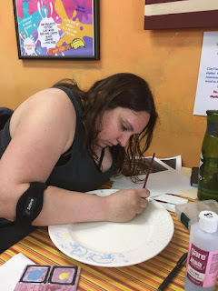
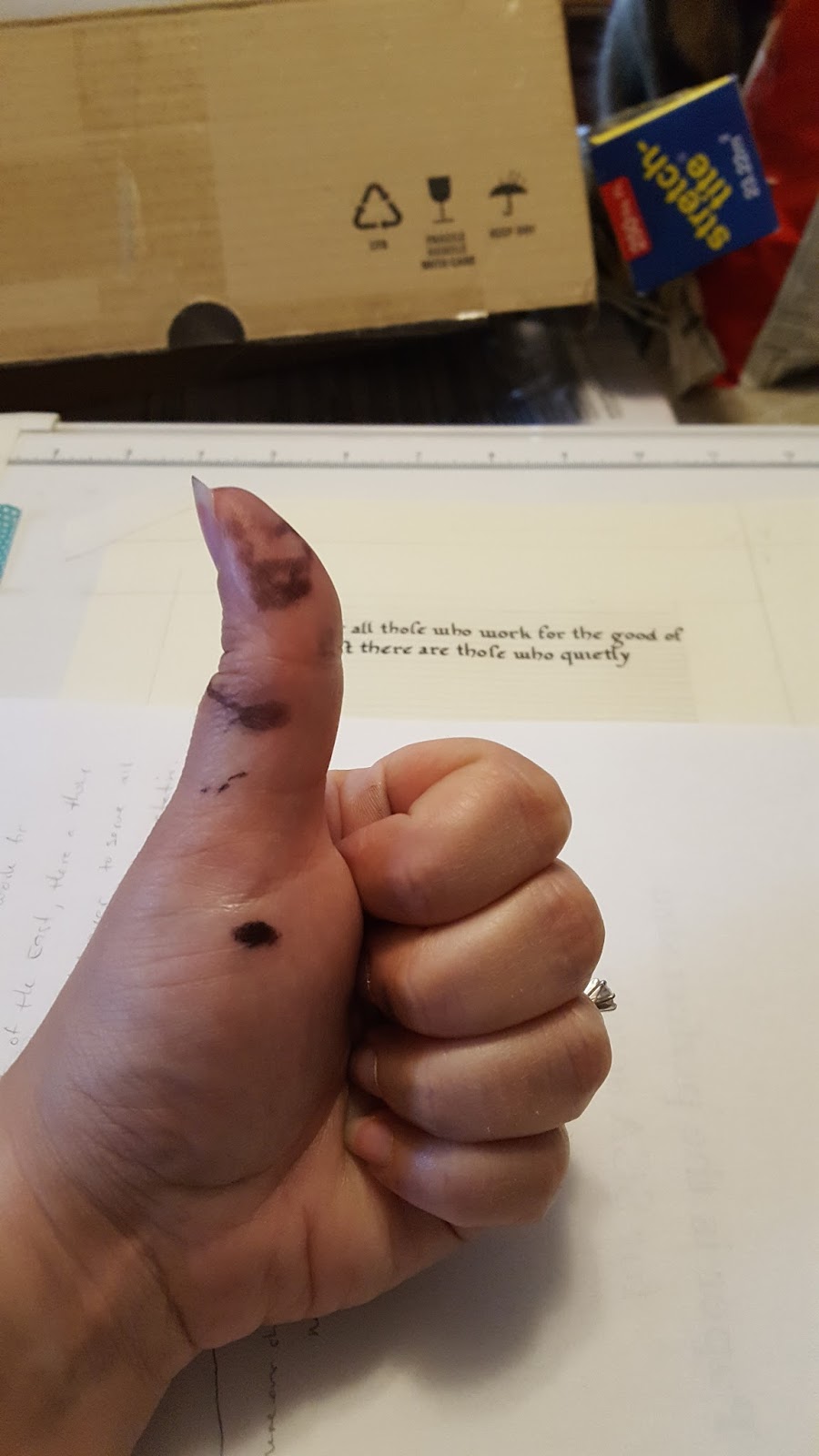
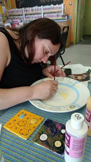
Embarrassingly, I had a flair up of pain from my lingering tennis elbow issue (hence the arm brace).  Good news - when you paint with friends, they can take progress pictures for you!
Claytime was enormously accommodating to my long painting sessions and spreading out on the table at points.  It turns out that when you're happy to share a table with other people (I'll get to that) and you behave like a normal human, they love you.  After each session, I took the plate home and thought about the next steps.

You can see the lines from the layout design.  These were all done in watercolor pencil (thin lines).  The thick lines are the first instances of the paint going on.  It looks like blue now, but it will darken once fired.

A few sessions in and I have some clear progress.  Most of the staff now knows about "the plate" and I have one regular gal on staff who knows me on sight.


So many lines to paint.....so many....
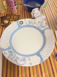
Most of the "easy" part is done.
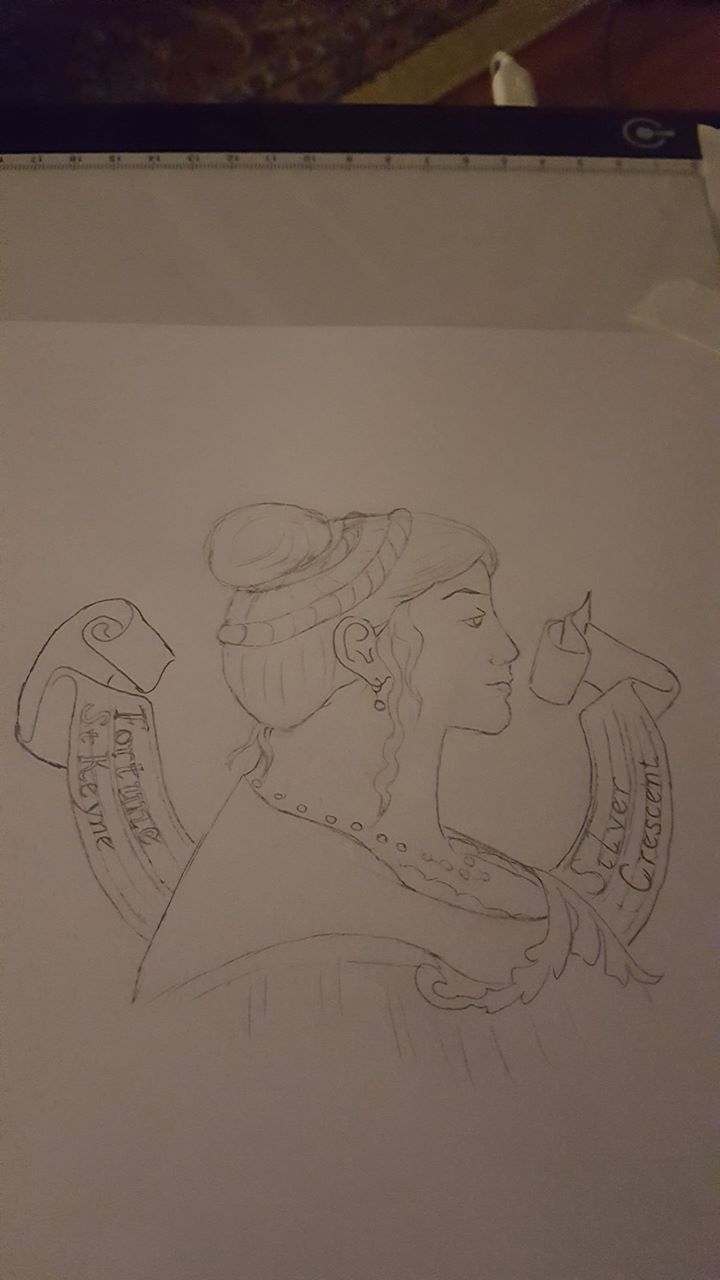
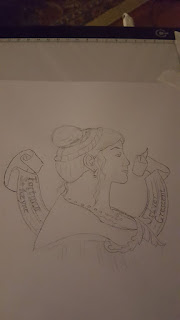
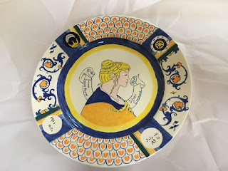
And now we get to the part where I dreaded working on this...the protrait.  It's been said elsewhere in my blog that I hate drawing people.  I feel like a massive art-impostor trying to draw people because I cannot make them look right.  The amount of sketches I threw out that no one saw or that were drawn,had comments,hated, and then threw out are numerous.  Part of my problem was fear of the derp face (though it's period) and the other part was trying to blend a real like protrait style with the majolica style.  I ended up going with just a majolica portrait after receiving some wise and balanced input.

Sometimes you need to eat junk food and use your light table as a desk while watching  HGTV to be properly inspired.

The hair under went some revisions at the Quintavia Business meeting, but this was the most successful sketch.  I opted to do Fortune's hair uncovered as that's how she wears it to events usually and the bun is one of her signature styles for no-nonsense mischief.  Most of the plates depicted a veil or hat of some sort.  That idea was discarded after disastrous attempts of putting a coronet on previous sketches.  I used my light pad to traces the curly-queues of the banner because at this point it was 10pm and I had to go paint the next day.  The lettering hand on the banner is a humanist.  The portrait was transferred using chalk paper (my savior) and I was then good to go!

Take that, tennis elbow!  I'm mostly free of your sabotage!

Lookin' good!
The next steps were the tedious parts: the scales, the brush lining, and the signatures.  Remember when I said I would share a table with other people?  Yeah.  One session of painting I was at the end of a table near and aisle where one kid would constantly hit the back of my chair as they ran by.  (Child running in a pottery studio...think on that....)  The fifth or so time it happened, I think I actually swore because my brush skipped.  At that point, the dad of said free running child finally noticed what the kid was doing (because up until now he's been wrangling two other screaming terrors).  And lo, holy hell was reigned down on said child by their parent and many apologies were made.  I was actually more embarrassed and apologized for swearing.  The next session I was at, I sat with Captain Shakey-Table himself.  I kept my expletives to myself this time.

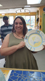
Boooyah!  This baby is DONE!!
Yeaaaaaaaaaaay!  I'm dooooooooone!

My artist mark.

My Claytime staff friend snapped this photo for me. :)
I may have said to the staff if it breaks in the kiln, I'll cry. 

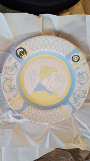
Weeks pass and then I get this photo in a text message from Simona who went to go pick it up.
Dear god, I'm a lunatic for doing this....

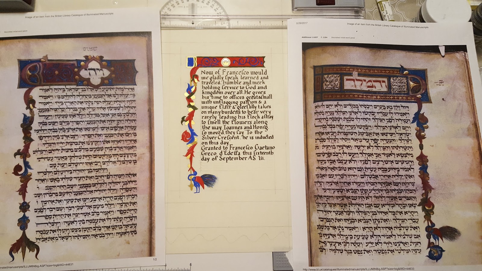
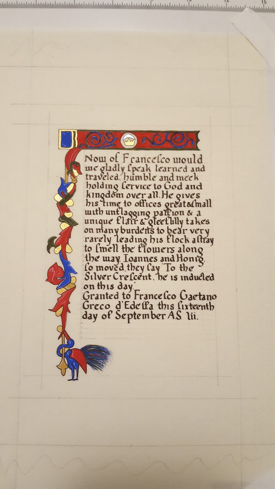
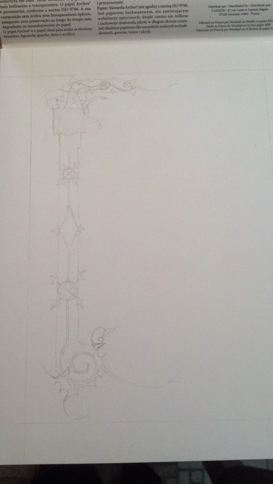
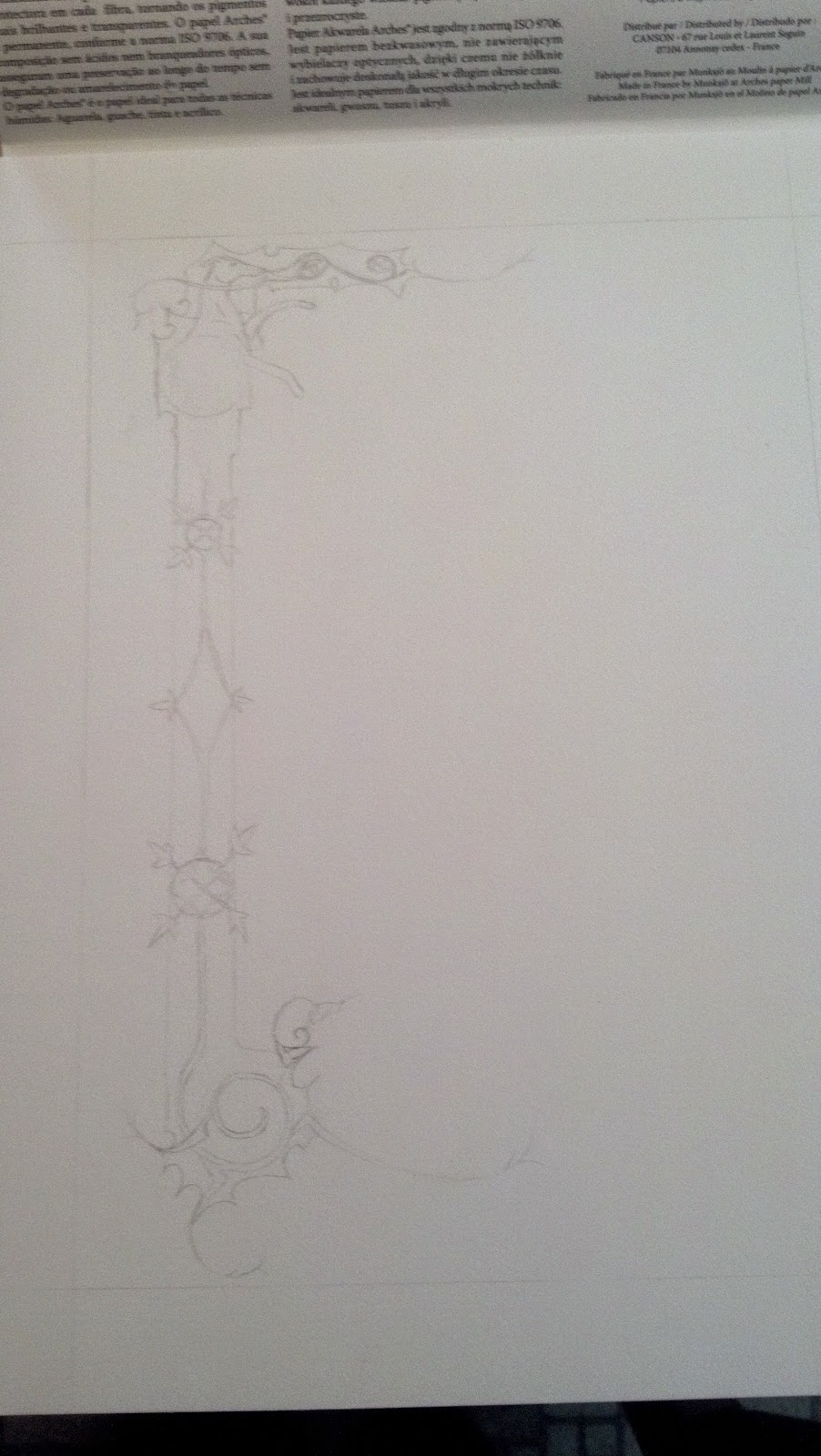
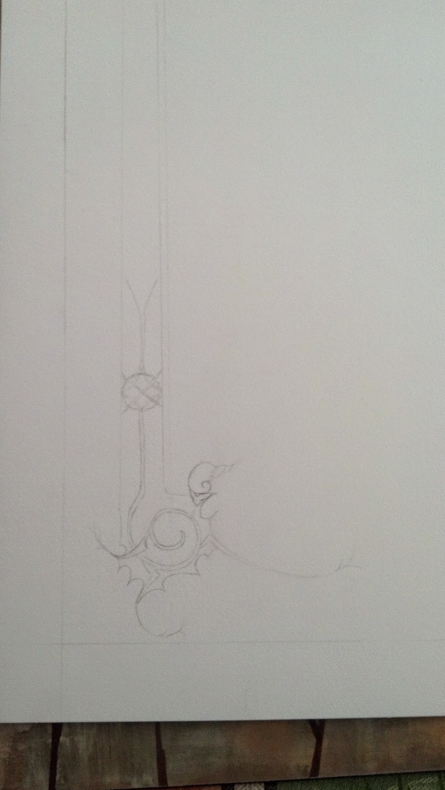
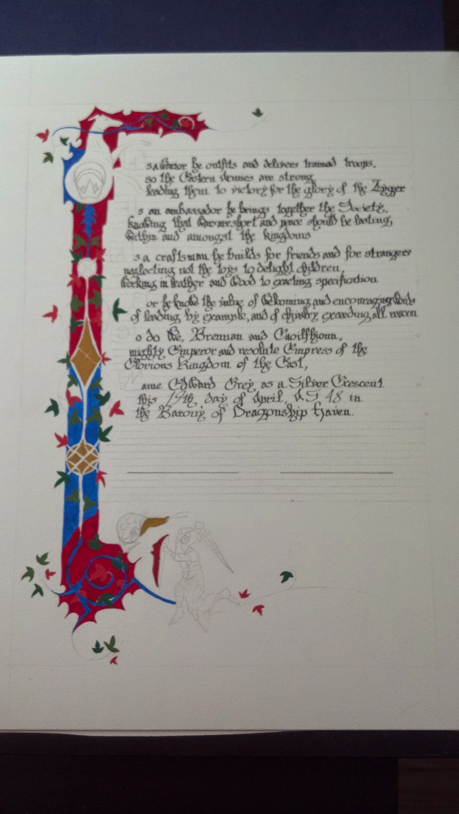
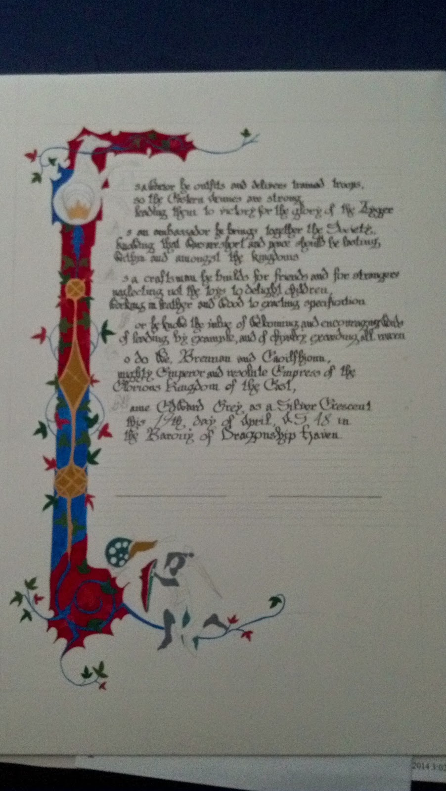
But wait...there's more!  I decided this needed a scroll for the royals to sign the week before it was due (in between another scroll project and silk banner painting).

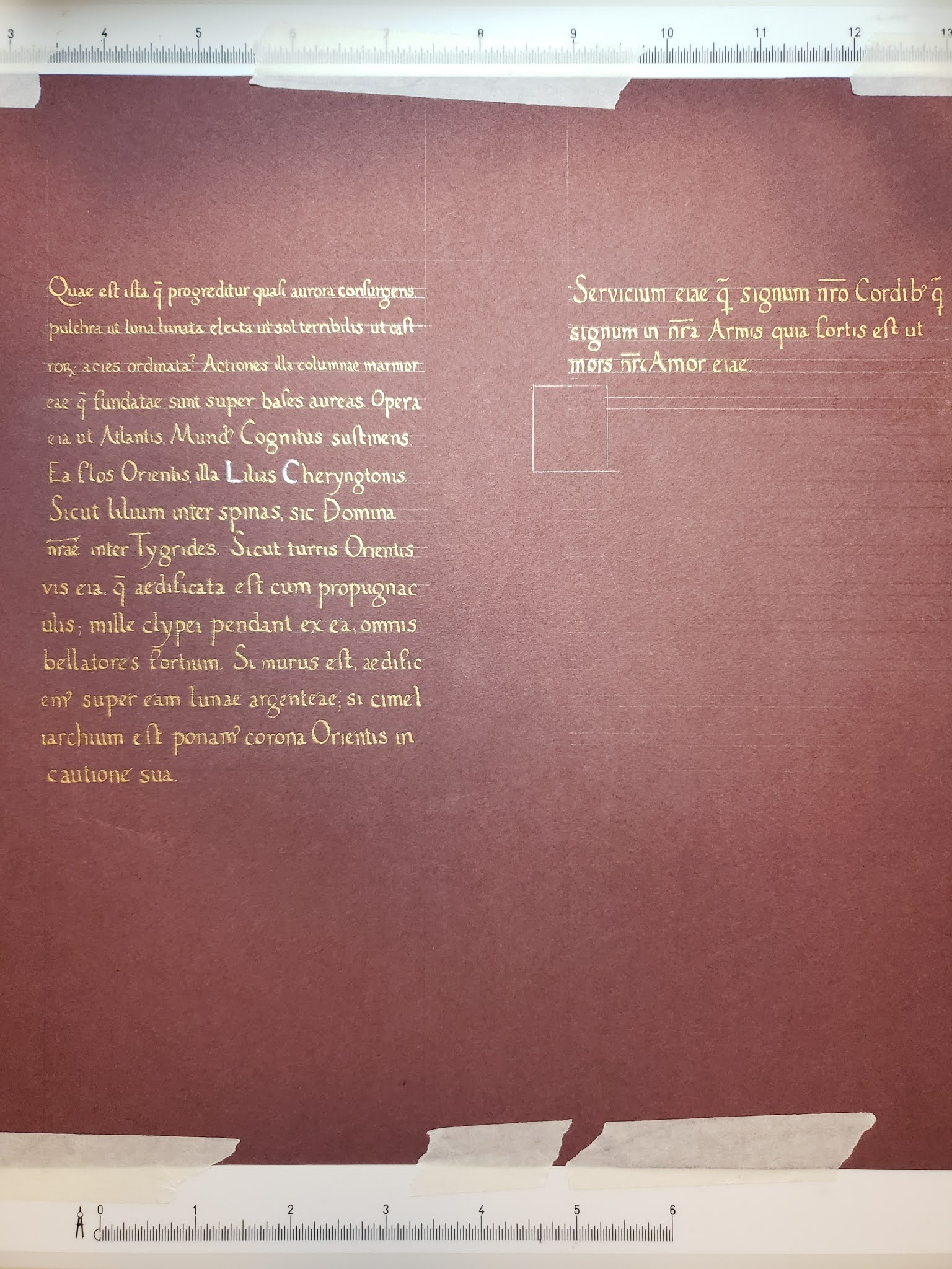
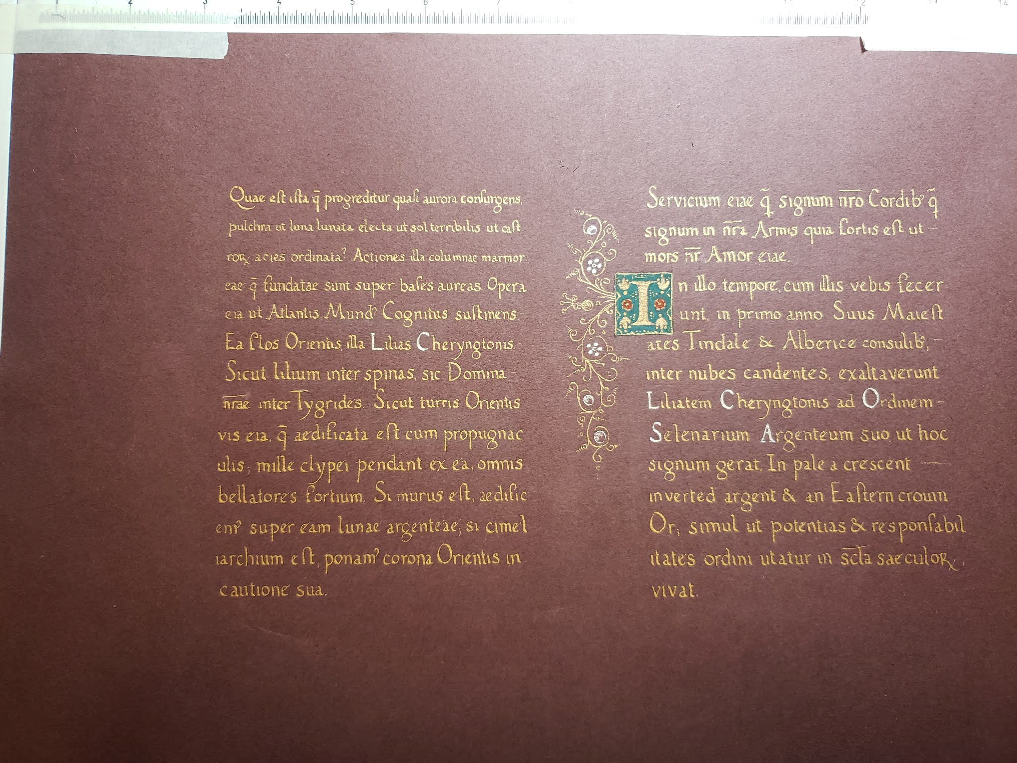
Eva wrote a lovely sonnet for this because she is amazing.

Calligraphy hand - Humanist by me
Words - Eva Woderose


Congrats, Fortune!  May you continue to smile upon Quintavia.

Special thanks to:

The ideas department: Simona bat Leon
Claytime painting company: Simona bat Leon, Marieta Charay
Sketch consultants: Nataliia Evganova, Eva Woderose, Thyra Eiriksdottir, Marieta Charay
Sounding board: Sergei Rozvad syn
Cheering section: House Strangewayes, Darostur, assorted members of Sharc and Lochleven


Monday, July 10, 2017

Silver Crescent - Fortune, Part 1

Sometimes you find inspiration for a scroll.  Sometimes, other people brainstorm a crazy idea and you're the first person they think that might actually do it.  Okay everyone!  It's story time that has been in the making since March.  Grab a snack and hold on to your hats...

*Full disclaimer - I had fun with this scroll and would have asked to do it on my own anyways.*

The background: In which our intrepid scribe does not see the bad idea bus that hit her, backed up, and ran her over again.

I have a weekly sewing group I hang with (and sometimes we even sew).  It was on such a Monday that Simona walked downstairs into the sewing room where we were all gathers and let me know that she "had a great idea" and "got the Signet to agree to give me the assignment".   First of all I'm confused....then I'm intrigued....then I remember the backdrop for Edward and Thyra's second reign and yell "what the hell did I get volun-told to do this time?"

The glee and mischief in Simona's eyes gave me such dread that I almost ran.  Anytime anyone is that pleased with themselves, you just know you're in for it.  To paraphrase - "Fortune's getting her Silver Crescent!!!  We (meaning House Strangewayes) had a great idea to do a majolica plate and thought you'd be the best person to ask!"

It's at this point I think, sure I can do that....and then I see what a majolica plate is.  It is the bane of my artful existence....drawing people.  Not even just people, big honkin' front and center portrait that is the goddamn centerpiece of the entire plate.   I am placated and assured that and I quote "Meh, it's period to make them derpy.  You'll be fiiiiiiiiine."  Famous last words.

Research: In which our intrepid scribe stares into the derp and the derp stares back.

Simona helped me out by finding museum pictures of real maiolica (sometimes spelled majolica) which were heavily decorated plates that gained the most popularity in the 15th c Italy, but were also present in England earlier in the century.  The real plates were tin glazed; featuring very vibrant colors and displayed fanciful art of either a historical or mythical variety.  The deep blue caught my eye on a lot of the plates and I decided that would be my focus color.  Of the pictures I was given, I chose various element that I thought would work for a scroll.


The design: In which our intrepid scribe starts to make with the ideas.

The first plate - I liked the idea of the circles which would hold the order symbol, Fortune's heraldry for her Grant of Arms, and what I initially though would be a circle for each of the signatures of TRM.  Things changed over the course of the project.  Fortune received her GoA with her Court Barony at Panteria which I no longer needed to include, but since Panteria was in May I had already made the decision to include the arms.  Late into the project, it was suggested to put the signatures on one circle and actually write the damn date on the plate since I had a design change which would have left it out.

The second plate - The least derp of the portraits and my inspiration.  I found it easier to do a right facing portrait for some reason so I stuck with it.  The scroll would also serve to display Fortune's name and the award title.

The third plate - This is where all the edge design came from.  The pattern was very regular, not too busy, and most importantly looked like it could be something I could do in a reasonable amount of time without fussing with it to death.

The timeline:  In which our intrepid scribe begins to contemplate her fate.

I didn't start the core work on the scroll until late April and had a firm deadline to have it completed two weeks before GNEW.  This would allow for the 7-10 days for the plate to fire and I needed to have it done before I left for Known World Heraldic and Scribal Symposium.  I did not want this kind of project hanging over my head.  Oh, and I was still 1) actively working on live scroll assignments for the kingdom, 2) working as the Backlog Deputy to the EK Signet, and 3) also working as the Quintavia MoAS.  Somewhere in there I also have husband, real life work, and a personal life.  Good times.

To be continues in Part 2....

Tuesday, February 16, 2016

Silver Crescent - Edward

This was my first live scroll and sadly the one that almost made me abandon hope of becoming a scribe in the SCA.  I'm not going to go into the details of the bad, but instead focus on the good on this.  It ended up being a labor of love from four people and was highly personalized to the recipient.  It's still hands down one of my favorite scrolls that I've done.

Constance asked me to do the illumination for Edward Grey of Lochleven's Silver Crescent scroll.  My first reaction was OMG!!!! YEAY!!  I've known Edward since the fall of 2002 when I was in my senior year of college and met him through mutual friends in the Realms LARP.  To me, he was always the ridiculously tall guy who was incredibly kind and incredibly pun-tastic.  Fast forward to my joining the SCA, realizing I know way more people than I thought, joining Lochleven's sister household of Darostur, etc, etc...long story short:  Edward was a dear friend and I was honored to be able to do the illumination on the scroll.

Scroll assignment: Order of the Silver Crescent
Recipient: Edward Grey of Lochleven
Hand: Gothic Littera Bastarda by Constance de St. Denis
Words: Thyra Eiriksdottir, latin translation for the tiny banner by Eva Woderose
Specs: Guache on Bristol
Source: Gorleston Psalter, England (Suffolk), 1310-1324, Add MS 49622, f. 193v.  

The illumination is done completely free-hand.  Sketching was done before the calligrpahy and finished all painting afterward.  Thyra and Eva added the personalized banner detail at the bottom.  I changed out the bird detail on the border for Edward's greyhound.

I remembered to take a LOT of progress pictures for this one.


Hound detail.  The circle will become the Silver Crescent drawing.

Snail!
Tiny Edward gets sketched in.


And done!
The big take away for this piece was that I needed to be more consistent when mixing paint which will alleviate brush stroke visibility.  Tiny Edward and the snail are my favorite parts of this piece.  When researching the vague time period his persona is from, this bit of marginalia jumped out at me.
Bonus points if you can read the latin banner! :)