Sometimes you find inspiration for a scroll. Sometimes, other people brainstorm a crazy idea and you're the first person they think that might actually do it. Okay everyone! It's story time that has been in the making since March. Grab a snack and hold on to your hats...
*Full disclaimer - I had fun with this scroll and would have asked to do it on my own anyways.*
The background: In which our intrepid scribe does not see the bad idea bus that hit her, backed up, and ran her over again.
I have a weekly sewing group I hang with (and sometimes we even sew). It was on such a Monday that Simona walked downstairs into the sewing room where we were all gathers and let me know that she "had a great idea" and "got the Signet to agree to give me the assignment". First of all I'm confused....then I'm intrigued....then I remember the backdrop for Edward and Thyra's second reign and yell "what the hell did I get volun-told to do this time?"
The glee and mischief in Simona's eyes gave me such dread that I almost ran. Anytime anyone is that pleased with themselves, you just know you're in for it. To paraphrase - "Fortune's getting her Silver Crescent!!! We (meaning House Strangewayes) had a great idea to do a majolica plate and thought you'd be the best person to ask!"
It's at this point I think, sure I can do that....and then I see what a majolica plate is. It is the bane of my artful existence....drawing people. Not even just people, big honkin' front and center portrait that is the goddamn centerpiece of the entire plate. I am placated and assured that and I quote "Meh, it's period to make them derpy. You'll be fiiiiiiiiine." Famous last words.
Research: In which our intrepid scribe stares into the derp and the derp stares back.
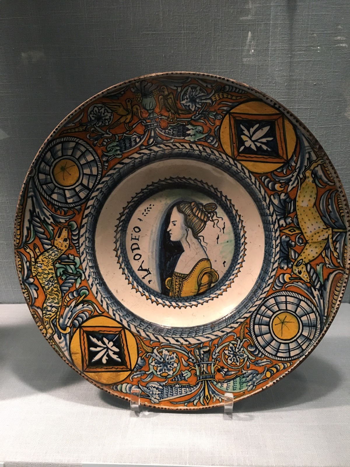
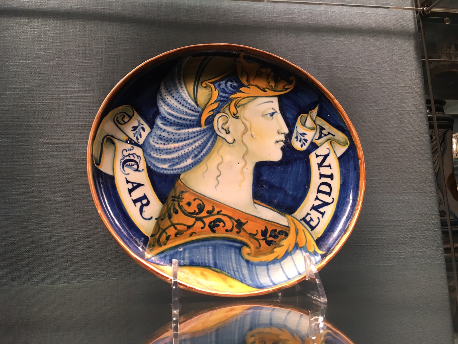
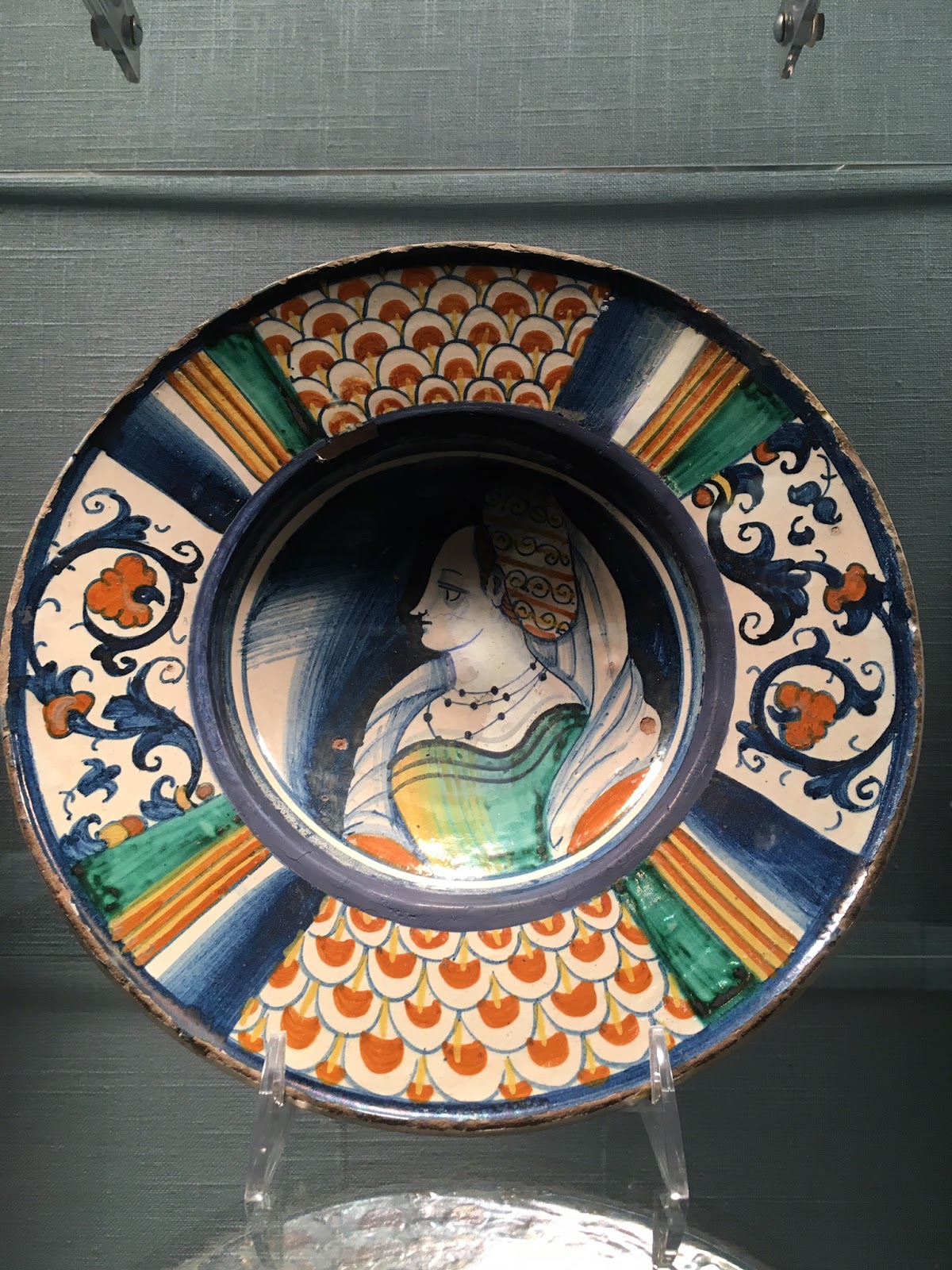
Simona helped me out by finding museum pictures of real maiolica (sometimes spelled majolica) which were heavily decorated plates that gained the most popularity in the 15th c Italy, but were also present in England earlier in the century. The real plates were tin glazed; featuring very vibrant colors and displayed fanciful art of either a historical or mythical variety. The deep blue caught my eye on a lot of the plates and I decided that would be my focus color. Of the pictures I was given, I chose various element that I thought would work for a scroll.
The design: In which our intrepid scribe starts to make with the ideas.
The first plate - I liked the idea of the circles which would hold the order symbol, Fortune's heraldry for her Grant of Arms, and what I initially though would be a circle for each of the signatures of TRM. Things changed over the course of the project. Fortune received her GoA with her Court Barony at Panteria which I no longer needed to include, but since Panteria was in May I had already made the decision to include the arms. Late into the project, it was suggested to put the signatures on one circle and actually write the damn date on the plate since I had a design change which would have left it out.
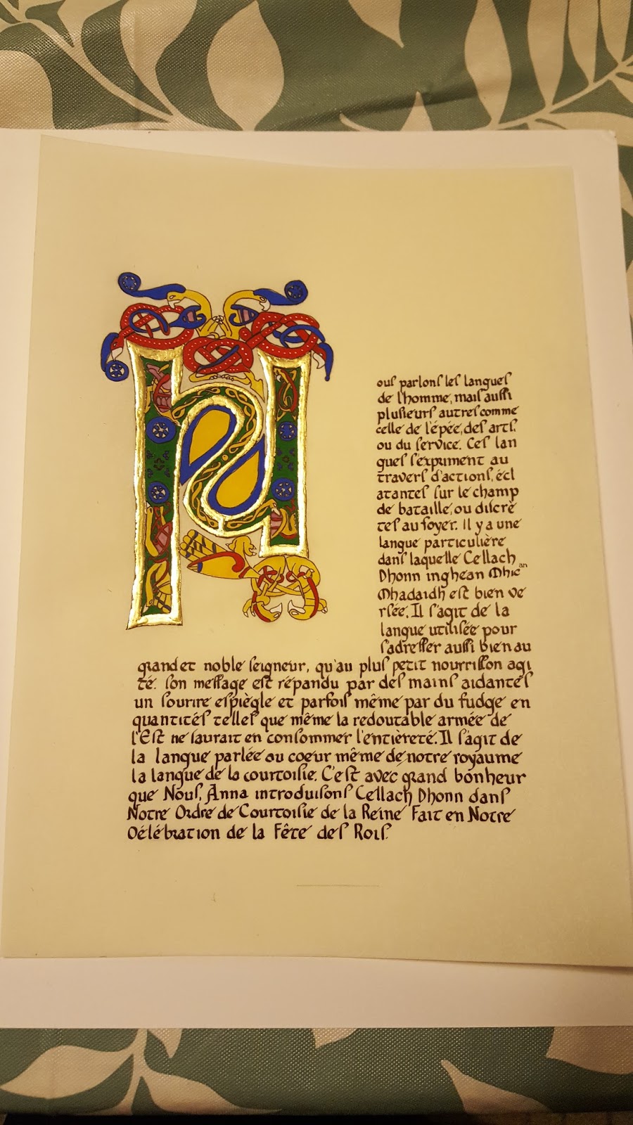
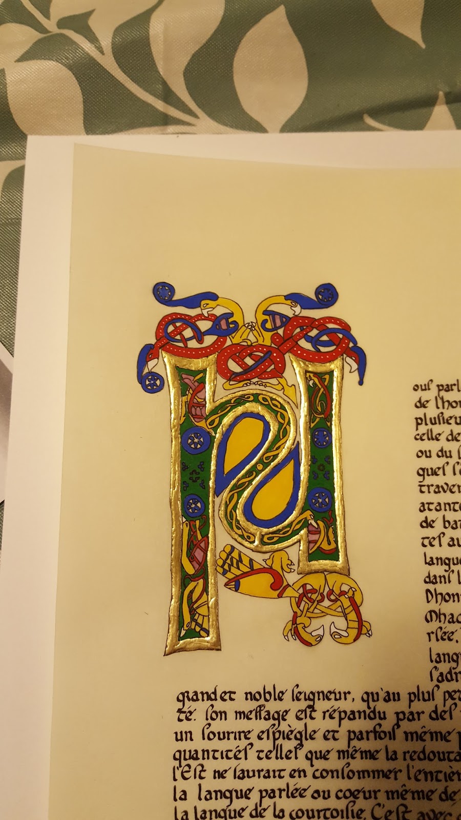
The second plate - The least derp of the portraits and my inspiration. I found it easier to do a right facing portrait for some reason so I stuck with it. The scroll would also serve to display Fortune's name and the award title.
The third plate - This is where all the edge design came from. The pattern was very regular, not too busy, and most importantly looked like it could be something I could do in a reasonable amount of time without fussing with it to death.
The timeline: In which our intrepid scribe begins to contemplate her fate.
I didn't start the core work on the scroll until late April and had a firm deadline to have it completed two weeks before GNEW. This would allow for the 7-10 days for the plate to fire and I needed to have it done before I left for Known World Heraldic and Scribal Symposium. I did not want this kind of project hanging over my head. Oh, and I was still 1) actively working on live scroll assignments for the kingdom, 2) working as the Backlog Deputy to the EK Signet, and 3) also working as the Quintavia MoAS. Somewhere in there I also have husband, real life work, and a personal life. Good times.
To be continues in Part 2....
Monday, July 10, 2017
Tuesday, April 25, 2017
Apollo's Arrow - Nergis
This is my first Apollo's Arrow (helping with Mikjall's for wording doesn't count) and I was happy to know that the recipient was a friend of Mikjall so I could pick his brain for ideas.
Recipient: Nergis bint Mustafa
Award: Apollo's Arrow with Award of Arms
Hand: faux-Arabic script
The biggest challanges for this scroll were two fold: 1) Finding a Turkish/Persian source for an archer that specifically did not contain a sagittary (which is the symbol for the grant level archer award) and 2) wording.
The source page was one of a few options from a Mongolian source scouted out by Marieta. I felt the illuminations were close enough to the feel of the Turkish pictures (and single Mamluk one) I'd scouted to give a correct sense of how to draw the figures. I found one that I felt would work (a group of archers squaring off against a dragon) and tailored it to a single figure and the dragon.
Now for the truly hard part - words. I messaged my closest poetry expert, Countess Marguerite (current King's Bard) for ideas for Islamic or Middle Eastern styles of poetry, because like an idiot, I thought this was something I could just whip up and have it done.
First off all, Marguerite is a treasure trove of poetry research. She found a few examples of Turkish and Persian poems and how they were constructed. She gave me all the tools for a great jumping off point and a taste of things that could be a rabbit hole of digging through medieval poetry. Thankfully, deadlines prevented any rabbit holes. :)
I chose to write a masnavi (also called mathnawi). This typed of poem was written by Persian, Kurdish, Turkish, and Urdu cultures and has a few poetic variants (usually differing in style and content). The mathnawi features rhyming couplets (aa/bb/cc pattern) with lines of 10-11 syllables. Typically these poems can be as long as they need to, but I wanted to keep it short to make sure I had time to work on the illumination. I ended up choosing to do an Arabic mathnawi (also called muzdawidj) which differs in that instead of couplets it uses a triplet rhyming pattern (aaa/bbb/ccc). The original page I was looking at didn't make it clear if it also followed the 11 and sometimes 10 syllable line pattern, but after checking in the Marguerite, we agreed it likely would (later, supporting pages I found also agreed with this). With a bit of peer editing for word choice, I had a poem. The arms don't follow the poetic pattern and I was fine not messing with it.
Recipient: Nergis bint Mustafa
Award: Apollo's Arrow with Award of Arms
Hand: faux-Arabic script
Words: Arabic mathnawi poem by me
Specs: gouache on pergamentata, Schmincke gold watercolor
Source: (in process of redoing the link)
of a fierce archer by the noble name
of Nergis bint Mustafa. They proclaim:
An Apollo's Arrow they would bestow
unto her. For she did nurture and grow
interest in archery; showing skill with her bow.
Ionnes, Sultan, Honig Sultana fair
to their beloved East far and wide declare
Nergis would also be given arms to bear:
Per chevron purpure and vert on a chevron above a
Specs: gouache on pergamentata, Schmincke gold watercolor
Source: (in process of redoing the link)
Words:
"To our great and wise rulers, words of praise cameof a fierce archer by the noble name
of Nergis bint Mustafa. They proclaim:
An Apollo's Arrow they would bestow
unto her. For she did nurture and grow
interest in archery; showing skill with her bow.
Ionnes, Sultan, Honig Sultana fair
to their beloved East far and wide declare
Nergis would also be given arms to bear:
raven migrant to chief argent three bunches of grapes leaved proper."
Something about the faux-Arabic hand makes it super fun. I will say I sit there and work through permutations of the letters until I get a good picture of what the word itself should look like. All in all, I'm proud of how this one turned out considering the art style is not in my comfort zone.
![]() |
Sketch of art and finished calligraphy. I had to re-tool the first line due to leaving out a word and had to cover for it. It still managed to follow the poetic rules and it worked. |
![]() |
Close up of finished art and calligraphy before I added the page border. |
Something about the faux-Arabic hand makes it super fun. I will say I sit there and work through permutations of the letters until I get a good picture of what the word itself should look like. All in all, I'm proud of how this one turned out considering the art style is not in my comfort zone.
Wednesday, April 19, 2017
Scroll Wording - Mikjall's Apollo's Arrow
This was done for Yule last year (2016). The assignment was given Baron Robert (currently Baron of Bergental) and he asked for some wording help from our local household Duchess. Long story short, Yule creeps up on everyone and I find myself giving Viking poetry/wording a try for reals this time.
I went directly to the Viking Answer Lady for help (http://www.vikinganswerlady.com/meters.shtml) to see if there was anything appropriate I could use or adapt for an Apollo's Arrow.
I learned two things: kenning are amazing complex/deep and the kenning I found for arrows is bad ass! :) I am no poet, but I tip my hat to all those SCA Skalds out there currently writing poetry. I think my meter is a bit off, but it's something to work on.
The wording is adapted from the Karlevi stone in Oland, ca. 1000 C.E (see above link for the original).
Tree of Thrud of hostilities,
the man whom the greatest virtues accompanies
-- most men knew that --
Mikjáll bogmaðr called
a more upright chariot-Vidur
of wondrous-wide ground of Skadi
Brion and Anna ring givers
Bestow Sun's War-needles
Cheat sheet of kenning from the above:
- Tree of Thrud of hostilities - tree of the valkyrie = warrior
- a more upright chariot-Vidur of wondrous-wide ground of Endil = captain/king of a ship/king of sea vessel (changed from Endil to Skadi in an effort to move the theme from the sea to the forest to change "captain" to be similar to "ranger")
- ring givers = king/queen
- war-needles = arrows, Sun's War-Needles was used to give the "Apollo's Arrow" name more of a viking feel.
Monday, March 27, 2017
Seamstress to the Crown - Svea
Recipient: Svea the Short-Sighted
Award: Seamstress to the Crown
Hand: humanist bookhand
Specs: guache on pergamentata
Source: http://www.bl.uk/catalogues/illuminatedmanuscripts/ILLUMIN.ASP?Size=mid&IllID=26600
I felt like this piece has a lot of things going right for it. The hand was light and airy enough, most of the capital letters looked correct (including most of the S capitals). The scaling I think went fine except for the illuminated capital F which is a tad too small. Measuring out the F to the predetermined block size went better than expected and all the guoache and shmincke gold cooperated.
Scroll text was fleshed out for reading in court:
"While the skill of our artisans is hailed through the Known World, it is also their generosity that makes them and by extension, the East truly great. For her creation of largesse for our kingdom do We, Brion the King and Anna the Queen name Svea the Short-Sighted as a Seamstress to the Crown. Done on this 25th day in March A.S. 51 at the Thawing of the Mud."
Award: Seamstress to the Crown
Hand: humanist bookhand
Specs: guache on pergamentata
Source: http://www.bl.uk/catalogues/illuminatedmanuscripts/ILLUMIN.ASP?Size=mid&IllID=26600
![]() |
My scroll with a print out of the original for comparison. Final scroll was 5"x7". |
![]() |
Close up of the finished piece. |
I felt like this piece has a lot of things going right for it. The hand was light and airy enough, most of the capital letters looked correct (including most of the S capitals). The scaling I think went fine except for the illuminated capital F which is a tad too small. Measuring out the F to the predetermined block size went better than expected and all the guoache and shmincke gold cooperated.
Scroll text was fleshed out for reading in court:
"While the skill of our artisans is hailed through the Known World, it is also their generosity that makes them and by extension, the East truly great. For her creation of largesse for our kingdom do We, Brion the King and Anna the Queen name Svea the Short-Sighted as a Seamstress to the Crown. Done on this 25th day in March A.S. 51 at the Thawing of the Mud."
Vigil Book - Kennimathor
I was asked by the talented crew putting together the vigil book for Kennimathor Geirrson to help with the illuminations. Ken (like Matthias) is of the knightly lineage of Earl Seannan an Chasur so this post has a few familiar heraldic beasties.
I'm very proud of the heraldry for this page for a few reasons. When I was originally looking at the exemplars from Colin's book and period sources, having the acanthus leaves and helm on a shield for a viking persona...just didn't fit right. Thyra suggested using the Sutton Hoo helmet for the helm and my husband, Sergei, suggested Odin's ravens as supporters instead of the leaves. I'll nit-pick about the ravens not quiiiite being even, but considering I was now drawing into the bound book instead of the unbound pages I'm not going to complain too much. The aesthetics were right on the mark and considering a new helm in the style of the Sutton Hoo helm was part of Ken's vigil regalia made me flail like a fan-girl.
Edward and Colin (the knights of Matthias and Ken respectively) had the same team create their vigil books, so both books followed the same format: (1) what I call the "preamble" praising the one called to vigil, (2) the recipient's heraldic charge with a shield, chain, helm, and mantle, (3) the knightly lineage, (4) family/household heraldry. I tried to keep that the same for Matthias and Kennimathor as well.
I lovingly refer to this as the "project of the secret court name person, by the people with secret court names". Thyra gets a pass on that since her name can be spelled with a "thorn" instead of a "th".
Vigil Book for Njal "Kennimathor Geirrson" Virtanen
Leather journal by Johannes Mikkinen (called Jenson)
Calligraphy by Thyra Eiriksdottir
Illumination by me - AEsa feilinn Jossursdottir (called Feilinn)
Gouache and ink on hot press paper.
![]() |
Close up of the front cover of the book by Jenson. |
![]() |
Thyra's calligraphy and text based off Njal's Saga. |
![]() |
Heraldry of Njal Virtanen, called Kennimathor. |
I'm very proud of the heraldry for this page for a few reasons. When I was originally looking at the exemplars from Colin's book and period sources, having the acanthus leaves and helm on a shield for a viking persona...just didn't fit right. Thyra suggested using the Sutton Hoo helmet for the helm and my husband, Sergei, suggested Odin's ravens as supporters instead of the leaves. I'll nit-pick about the ravens not quiiiite being even, but considering I was now drawing into the bound book instead of the unbound pages I'm not going to complain too much. The aesthetics were right on the mark and considering a new helm in the style of the Sutton Hoo helm was part of Ken's vigil regalia made me flail like a fan-girl.
Bonus - heraldry with straight lines! *scribal swoon of joy*
![]() |
Knightly lineage. |
Gryff's stags continue to haunt me as the most difficult of the lineage shields. The stag on the left says "Look at me, for I am refined and elegant!!!" The stag on the right (much like the right stag in Matthias' book) says "Derp" to me. *sigh*
My favorite of the bunch continues to be Gregor's lion. Despite all the fussy elements (claws and fluff), my brain has an easier time making it look correct for some reason. Pigs are hard to draw (Colin), but then again so are greyhounds with a border of fleur de lys (Edward from Matthias' book). Both of these venerable gentleman get the squinty-eye of hard to draw heraldry honorable mention.
![]() |
Heraldry for the Household of Lochleven. |
I had a great time with this book and both Thyra and Jenson were a joy to collaborate with. Congrats, Ken!
Queen for a Month - Feilinn's viking dress
After the Edward III and Thyra II World Tour #2, the sewing ladies of the Worshipful Company decided that each person was going to get a new fancy outfit in as if they were "Queen for a Month". Thyra was my project manager and Marieta was my concept designer for this one.
What did I want? Cute viking...and a wolf...also blue...and something that fit.
What this meant was we finally delved into my stash of fabric and made a full viking under dress and apron. The main component of the apron was something termed "Fantasy Viking" in the SCA...I wanted a wolf design right on the apron. I had found a design I liked on Pintrest from a million years ago (in which I also found examples of Thyra and Aikaterine in lovely viking dresses when they were queens).
This is where I confess this is my third/fourth embroidery project and biggest applique of the bunch. I was taught how to do a split stitch specifically for this project. I did all the hand embroidery for this with the exception of the sun detail on the wolf's collar (done by Thyra) and the eye detail (done by Marieta). The wolf is 30% merino wool felt, layered on itself, and the apron is either a very light weight wool or very wool-like linen. The design is based off a Fenris wolf design from the depths of Pintrest, edited to remove the rope fetters/shackles on the paws. I kept the collar and leash to add color and movement. The thin bits of felt were tacked down with fusing and pinned in place while I started the stitching process. Dot details are (terrible) french knots.
Queen for a Month: Wolf Applique
Wool felt stitched with wool thread.
![]() |
Yard stick shown for scale. |
![]() |
Close up of the stitching and detail work. I have been told I have the tiniest stitches. My favorite is the gold eye bead on the wolf. |
QoC - Cellach Dhonn
Recipient: Cellach Dhonn inghean Mhic an Mhadaidh
Assignment: Queen's Order of Courtesy
French translation: Kirsa Oyutai
Hand: carolingian miniscule
Specs: gouache on pergamenata, 23k gold gilding
Source: Book of Kells, Gospel of St. Matthew
Assignment: Queen's Order of Courtesy
French translation: Kirsa Oyutai
Hand: carolingian miniscule
Specs: gouache on pergamenata, 23k gold gilding
Source: Book of Kells, Gospel of St. Matthew
![]() |
Finished scroll |
![]() |
Close up of the capital "N" |
![]() |
Original from Book of Kells coloring book. |
This was my second full attempt at gilding and on a much larger scale. The original for this was actually from a Book of Kells coloring book. I tried to cross reference the colors associated with it to the original manuscript page which I found...and then lost the link to. My internet-search-fu has since failed me at fining the link to the original. The knot work on for the birds of the top was simplified to only be one large thread and one accent thread. Originally I had thought to keep it simple and have the interior of the N's legs one solid color. After doing the gilding and painting of the birds, I decided just having the flower wheels on the interior was going to be too plain. The beast-knots in the interior were hand sketched/simplified from the originals and all the detailing of the squares and flowers where free-handed while painting.
Overall, I'm happy with the piece. I think there are some things I could have done better for scaling of the capital to the body. Painting was actually easy and the consistency was spot on. The gilding I'd like to practice more because of issues I had with making the miniatum flow nicely (so there are ripples in the gold that to me are noticable).
Words were by me and read as follows:
"We speak the languages of man, but also many others such as the language of blades or of arts or of service. These are languages spoken through deeds, boldly on event fields or quietly at home. There is one special language in which Cellach Dhonn inghean Mhic an Mhadaidh is well versed. It is the language spoken when addressing a high noble lord or the youngest fussing babe. Its message is spread by helping hands, a mischievous grin, and sometimes even by the gift of fudge so plentiful not even the fearsome Eastern army could consume it all in one sitting. This is the language spoken by the heart of the kingdom; the language of courtesy. It is with great joy that We Anna, induct Cellach Dhonn into Our Queen's Order of Courtesy. Done at Our 12th Night Celebration."
Subscribe to:
Posts (Atom)