Showing posts with label Software. Show all posts

2017-08-10

Tuning up the Tabula

Readers will know I have created a digital surrogate of the Tabula Peutingeriana, the only detailed chart of Latin antiquity to show the lands, cities and roads of the known world. I am now tuning it up with extra features. The newest is an animated and interactive means of showing how the archetype must have looked, comparing it to the error-ridden impression given by the sole surviving manuscript.

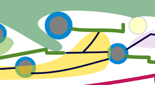
Here's an example of what you see: the normal picture is a clean schematic plot from the manuscript including obvious errors such as that below, which shows towns in Roman Africa as blue circles and a main road which I have colored green. Look carefully and you will see that the copyist has unaccountably shifted a section of the road upwards, closer to the sea (green area):

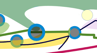
I want to show readers wordlessly how that defect can be repaired. In the picture below, you can see how the town and the section of road can be shifted downward and re-integrated into the route:

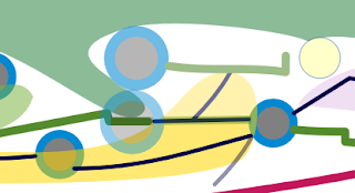
The coastal town that is moved here is Hadrumetum, now Sousse in Tunisia. The technique I have invented to highlight such changes is to show a gradual transition where the one disappears and the other gradually takes shape at the same time. Go to the website, http://piggin.net/plold.htm, and bring up the chart. If you hover your cursor over that pale yellow button at top right, the picture hereabouts begins to slowly change, as the following still picture, taken mid-way through the transition, shows:

You can see that a side road (to Cubin, an unidentified place) also shifts. So far I only have three of these transitions built into the chart. It took me a couple of days of tinkering with Javascript and cascading style sheets before I stumbled on a simple but effective technique involving the "hover" feature in CSS3, but it does take a while to write the code by hand for each case.

2016-11-22

Digital Humanities

The introduction to my text-archaeology project has just been revised, and now I need your input on how I could make it even better. The site should be like the ruins of Pergamum, a place any literate tourist can explore unaided, enjoying the pleasures of discovery at every corner. Here's the new introductory text:
The fifth-century Great Stemma was probably drawn on a roll of papyrus of standard height (30 centimetres say) and at least as long as the bed you sleep in. My reconstruction proposal, the Piggin Stemma, obviously can't be viewed on a smartphone or any other digital device unless you move it around. So scroll left and right; zoom in to read words (and zoom out to see the full expanse); use the built-in controls.
... If the Romans had had computers, this is how they would have read their scroll-format books on them.

As an example of the digital humanities, the Piggin Stemma invites you to explore beyond first sight and enjoy the pleasures of discovery. This innovative chart was rebuilt with a coding language named SVG. It enables me to hide a guidebook in 12 overlays that remain invisible until you need them. ...

It's not a film. Once you are ready, you will have to tap some controls to make the interactive layers appear. Each right button makes a new effect visible: the corresponding left button makes the overlay go away. Try it. The overlay entitled "Damage" even includes an animation ... showing how roundels were moved. ...

A reassurance: you came here because you are attuned to graphic desígn and the psychology of visualization. You will see here hundreds of Hebrew names you may not know. I have translated them from Latin into English to make them less alien, but don't be overwhelmed by names or glosses. You are on a guided tour of an exotic place: late-antique graphics technology. Don't be sidetracked by the late-antique theology (unless that is your passion).

First up, just concentrate on how a fifth-century designer uses circles to visualize kinship and depict eras of time. The leftmost flag ... of each overlay offers you enough context to get started on your walk through this text-archaeology excavation.

If you like this new method of presentation, and I am sure you will, recommend the site to your friends. Send them [the] URL: http://piggin.net/stemmahist/envelopereconstructor.htm Don't send them a direct link to the SVG file, or they may get baffled.... Enjoy the tour.
Are my ideogram pictures above coherent? Does anything about the project puzzle you or remain unexplained? Do you have any other digital humanities examples you can point me to that present historic charts interactively with overlays? One way to reply is to use the comments box below.

2014-10-27

Digital Reviews

Getting manuscript documents (and early printings) online in a form that is electronically readable is only half the battle: keeping it accessible and raising standards to the point that multiple projects could be united into a permanent digital library are the follow-ups we tend to forget.

Germany's Institut für Dokumentologie und Editorik is now publishing RIDE, a review of digital editions (issue one is out and issue two is coming up).

The checklist that reviewers use to assess accessibility and inter-operability is an interesting one. There's a chart of technical issues noted so far and here are some of their criteria:
  • Which licenses are used to determine the copyright of the material published by the projects?
  • Do projects adhere to a standard data model like TEI?
  • Is the raw data accessible, either for the individual parts of the edition or as a whole?
  • Which interfaces do the projects support to allow reuse of their data?
The questionnaire picks out other more general issues like:
  • Is search with wildcards available?
  • Are the methods employed in the project explicitly documented? 
All points that I'll have to figure out. I document my methods, but this documentation is scattered, with part of it appearing here in the blog. It should all be combined in one place.

Like most digital publishers, I am keen to put material in the public domain, but am cautious about the form of declaration. I'm sceptical about TEI. I do want to put the raw data out there, but we are all aware that the rate of uptake is going to be minute: at the most, three or four researchers per century are likely to want to use my MS Excel tables. The interfaces question refers to things like an API or Representational State Transfer principles, which are only vaguely in the mind of independent researchers running single-person projects.

2010-09-12

Diplomatic Editions of Diagrams

I've so far looked in vain for scholars' ideas on how to create what one might describe as a "diplomatic" edition of a diagram. As a 21st-century scribe, what one is looking to do is to recopy an antique or medieval diagram while:
  • preserving its original language and wording;
  • adapting its script and linework to contemporary lettering and drawing conventions;
  • unwinding physical deterioration that mars the old medium.
The last objective could perhaps be adequately met by taking a photographic image of an old document, and photoshopping away the blotches, mould, tears and distortions. There is an interesting 2008 account (pdf) in e-Perimetron of how this can be done with old maps. But this does not allow much editorial amendment, nor does it make the document readable. Since the age of print began, we expect documents to be recast with modern typographic lettering.
In the digital age, we also expect a document to be searchable, and it would be perverse nowadays to publish on paper only: one must produce a full digital edition.
The solution I have been experimenting my way towards is to use XML documents which contain the text and all the necessary instructions to draw a vector image of the original diagram and lay it out faithfully, either on the screen or on paper via a digital printer. XML files can be directly edited: every word and letter can can be checked and altered if need be without using proprietary or sophisticated software.
The images on my website have all been created using OpenOffice Draw and the master files are saved in odg format. To publish them online, they are converted to Flash files.
I have been learning ways to manipulate odg files so that they could become the definitive transcripts of original manuscript pages, or provide the basis for merged, critical, digital editions. In fact it ought to be possible to do this so one could have several languages all stored in the one file: Layer 1 would be Latin, but you could easily swap to a Layer 2 in English, Layer 3 in German and so on.
I prefer to write transcripts into Microsoft Excel, which allows you to standardize the data, mark it up, sort it, add fields and so on. An early problem was how to convert Excel data into a format that can be used by OpenOffice Draw. These are the steps I take:
  • I create an Excel spreadsheet which attaches the necessary XML tags to the left and right of the list data;
  • An odg file is in fact a zipped-together folder of files, one of which is named content.xml and contains the text within the drawing;
  • Use IZ Arc to open the odg file, and extract content.xml to another folder.
  • Open content.xml and prepare to overwrite all of its text sections as follows;
  • Copy the XML tags and data which you have generated using Excel;
  • In Windows, right click the file icon of content.xml and choose edit from the context menu. Paste the data into content.xml;
  • Save the new version of content.xml;
  • Drag the altered file back into the IZ Arc window and save the odg file;
  • OpenOffice Draw will hiccup a bit as it processes this odg, but it will open;
  • The texts may not be properly formatted. Highlight everything and choose Default style to reformat them, then save;
  • More fixing in OpenOffice Draw then includes converting background to invisible. To make the borders invisible, change "line" to invisible as well.
The Excel file that begins this process includes sequential position information so that each draw.frame element has its own position on the page and is not overwritten. It is easy to construct 10 or more columns of data this way. The first element, at the upper left, is enclosed in the following tags:
  • At the beginning of each element, these three opening tags:
    • draw:frame draw:style-name="gr1" draw:layer="Text" svg:x="-56cm" svg:y="-19cm"
    • draw:text-box
    • text:p

  • At the end of each element, these closing tags:
    • /text:p
    • /draw:text-box
    • /draw:frame

The minus 56 and minus 19 in this case mean the text begins 56 centimetres to the left and 19 centimetres above the top left corner of the virtual canvas in OpenOffice Draw.
I am still thinking about ways to make the resulting document more easily editable.