Germany's Labour Agency believes it has the most fine-grained statistics on labour in the world, illustrating place by place throughout the country many things you thought you knew, but couldn't quite prove to your kids, such as how poor educational performance correlates with unemployment.
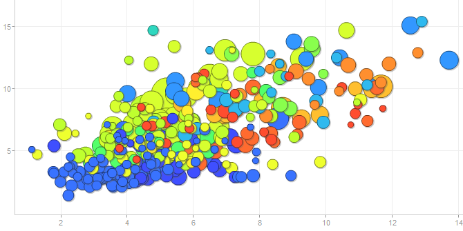
It has now thrown this data storehouse open to the public using dynamic data visualization tools, and the displays are impressive and amazing. Here for for example is a graph where lack of a high-school leaving certificate (X axis) is correlated with regional unemployment (Y axis) whereby circle size represents city or county population and circle colour represents alphabetical order of state name (from blue (B) to red (T), which is about the dumbest thing I can find in this intelligent package).
The image above is from a page compiled on the fly. You can alter all four of those axes to other data streams to correlate whatever you please. There's even a slider to go back in time. This is an amazing and impressive demonstration of data visualization for everyman.
According to a report by Klaus Tscharnke of dpa (in German only), the Bundesagentur für Arbeit (Federal Labour Agency) which operates the nation's labour exchanges purchased a Google Analytics package to visualize its database in this way. That explains why the URLs are in English, which is handy since there is no English version of the data controls themselves.
What does the above graph illustrate? Look at the two biggish blue discs at top right: one represents central Berlin and the other the adjacent Neukölln region of the capital. They have enormous school dropout rates and huge heavily frequented labour offices where people apply for the dole. If you have been a tourist in Berlin, you have perhaps noticed the poverty amid the glamour.
The discs do bunch themselves along a diagonal line. At far left on the graph are Bavarian cities like Regensburg, where only 2.7 per cent of the working population failed to complete high school, and only 2.4 per cent are unemployed. That does strongly suggest a correlation that's not just true in Germany, but worldwide. Show it to your kids.
2016-07-17
2016-07-08
What's It About?
I get asked: what's your book's title, and what's it about?
The working title is: Expositor. The project investigates the world's oldest information visualization, a 3-metre tree diagram drawn up in the Roman Empire. This chart in Latin which sets out biblical genealogies from Adam to Jesus, intertwined with threads of Jewish political history, has been hidden in plain sight for centuries and has never been examined at book length before.
The original chart is now lost, but medieval copies allow us to reconstruct how this diagram might have looked. Its historic title is unknown, so it is nowadays code-named the "Great Stemma" (GS). You can see a provisional reconstruction of it online on my website, which serves as a long-term data-dump for my research (and is not especially easy to read).
The book will a good read. Using a narrative in the style of a documentary film, Expositor meets with investigators, proceeds from clue to clue, skirts dead ends, and climaxes at a solution which reveals the origin of the GS. As the story unfolds, it emerges that the chart is five centuries older than previously thought, probably drawn with disciplined skill and careful design in about 420 AD.
Expositor will propose that the GS was inspired not by maps or geometry, but by board games and the abacus, and relates how it was the progenitor of a 16th-century craze for genealogy as well as a remarkable Chinese chart, along with all our modern trees, timelines and mind-maps. The book culminates in a discussion of what it means to visualize information.
The Roman-era chart effectively invented a new technology, leading up to the graphic user interface used in every touch-screen today. I argue that diagrams and visual displays exploit the computing power of human vision to short-cut reasoning tasks. Cognitive science is only now able to grasp what a major shift in human culture this was. My research places that shift in the ancient world.
Michel and Marianne
A scala in Latin is a ladder. The German artist who drew the infographic below in 1965 must have had an education in the classics, because a ladder was the figure he chose as a matter of reflex to compare factory pay-scales around the globe.The dpa-infografik company recently re-issued it to mark its 70th anniversary in business.
As an information visualization this is fairly simple, setting up the vertical scale and scattering the data loosely to draw the reader in. The scattering is an early version of a technique known as the jitterplot, which is handily explained in this infographic from @joemako
These numbers are an education in what has changed in the world. Back then, US factory workers had the "good jobs" that have now been destroyed by Washington's economic policies. Curiously, German workers earned only half as much. I was surprised to see New Zealand workers were so high up. New Zealand did not feel particularly prosperous in those times. It was hard to buy quality goods. Availability of everything from cars to shoes was limited by a legal regime called import licensing.
Still, the numbers here supposedly factor all that in, comparing hourly rates of pay, converted to Deutschmarks and adjusting for differences in purchasing power. A US worker got 8.70 DM and an Indian worker 0.51 DM per hour.
The figures are types: Uncle Sam, a RCMP mountie, an English trawlerman, the typical German Deutscher Michel, an Austrian in gamsbart hat, a shapely French Marianne, an Argentinian gaucho, a Japanese salaryman, a Yugoslav miner and an Indian porter. In those days it was thought clever, not racist, to depict people by stereotype.
-- dpa-infografik GmbH
As an information visualization this is fairly simple, setting up the vertical scale and scattering the data loosely to draw the reader in. The scattering is an early version of a technique known as the jitterplot, which is handily explained in this infographic from @joemako
These numbers are an education in what has changed in the world. Back then, US factory workers had the "good jobs" that have now been destroyed by Washington's economic policies. Curiously, German workers earned only half as much. I was surprised to see New Zealand workers were so high up. New Zealand did not feel particularly prosperous in those times. It was hard to buy quality goods. Availability of everything from cars to shoes was limited by a legal regime called import licensing.
Still, the numbers here supposedly factor all that in, comparing hourly rates of pay, converted to Deutschmarks and adjusting for differences in purchasing power. A US worker got 8.70 DM and an Indian worker 0.51 DM per hour.
The figures are types: Uncle Sam, a RCMP mountie, an English trawlerman, the typical German Deutscher Michel, an Austrian in gamsbart hat, a shapely French Marianne, an Argentinian gaucho, a Japanese salaryman, a Yugoslav miner and an Indian porter. In those days it was thought clever, not racist, to depict people by stereotype.
2016-07-07
Imperial Handbook
Among the most precious documents to survive from late antiquity is the Notitia Dignitatum, a handbook to the Roman Empire's civil government and military structures as of about 400 CE.
It survived in a book known as the Codex Spirensis which vanished before 1672, but was copied out half a dozen times by interested readers. One of those copies, the Vatican's arrived online on July 7 and this is a major event for anyone interested in this extraordinary sourcebook. Dr Ingo Maier, who has spent many years studying the handbook, has a website devoted to many of its details.
Fairley's English partial translation of the text (1899) is online at Fordham. Online, you can compare the Vatican copy, Barb.lat.157 with three other online copies: the two in clm10291 in Munich and that in BNF lat. 9961 in Paris (jump to fol. 72r to begin reading the latter). As far as I know, the Trent codex is not online and from the Oxford codex, only the pictures are on the internet.
Below is the Vatican codex's copy of the Provincia Dalmatiae page, compared to the W copy (Munich) below it. It is plain that the Vatican copy is more fanciful and that the artist has willfully converted the town into an early modern one.
However the other manuscripts are hardly more accurate, as you will see from the Luke Ueda-Sarson Praeses Dalmatiae (i.e. Governor of Dalmatia) composite page. Many of the images, including the specific shields of the military units, require considerable expert interpretation to understand.
Even this figure of a coach and horses needs interpreting:
My especial personal interest in the Notitia is that the Codex Spirensis also preserved a major Roman legal diagram which acquired the medieval name arbor juris or arbor consanguinatis and which is among the important classical precursors to the invention of information visualization in late antiquity:
Here is the full list of 38 uploads by Digita Vaticana on July 7 bringing the posted total to 4,794
- Arch.Cap.S.Pietro.F.28 - Details
- Barb.lat.157 - Notitia Dignitatum (above) - Details
- Borg.copt.109.cass.XVIII.fasc.64 - Details
- Capp.Giulia.XVI.16 - Details
- Chig.H.VI.188 - Details
- Ott.lat.1190 - Details
- Vat.gr.186 - Details
- Vat.lat.401 - Details
- Vat.lat.424 - Details
- Vat.lat.466 - Details
- Vat.lat.534 - Details
- Vat.lat.724 - Details
- Vat.lat.751 - Details
- Vat.lat.762 - Details
- Vat.lat.764 - Details
- Vat.lat.769 - Details
- Vat.lat.774 - Details
- Vat.lat.777 - Details
- Vat.lat.798 - Details
- Vat.lat.799 - Details
- Vat.lat.800 - Details
- Vat.lat.801 - Details
- Vat.lat.802 - Details
- Vat.lat.805 - Details
- Vat.lat.806 - Details
- Vat.lat.810 - Details
- Vat.lat.811 - Details
- Vat.lat.816 - Details
- Vat.lat.817 - Details
- Vat.lat.824 - Details
- Vat.lat.825 - Details
- Vat.lat.830, Details,
- Vat.lat.839, Details,
- Vat.lat.842, Details,
- Vat.lat.843, Details,
- Vat.lat.11543, Details,
- Vat.lat.12939, Details,
2016-07-06
Romantic Love
One might argue that western ideas of romantic love have their roots in certain ideas of the Renaissance, when the Roman poet Ovid was re-interpreted through a Christian lens and seen as a harbinger of courtly and noble love. In fact, Ovid was probably just a Boris Johnson of ancient Rome, a public school cad with a gift for words, and not a person particularly worth following.
The Vatican Library has just digitized an Epistulae of Ovid drawn ca. 1430-1440, possibly in northern Italy, which depicts in its margins ten pairs of lovers framing the start of each letter (see article by Rabel).
Leaf through Ross.893 to see them. Here for example is Leander of Abydos clutching the M of "Mittit Abydenus ..." like a shield as he writes in Heroides Letter 18 of his desire to swim long distance to see his girlfriend:
You can also admire him wearing a most extraordinary Italian Renaissance high hat as letter 19 arrives by return of post from lovely Hero:
Here is the full list of 32 digitizations uploaded on July 5, 2016:
- Borg.copt.109.cass.IX.fasc.29 - Details
- Borg.copt.109.cass.XIX.fasc.71 - Details
- Borg.copt.109.cass.XIX.fasc.74 - Details
- Borg.copt.109.cass.XVII.fasc.62 - Details
- Borg.copt.109.cass.XVII.fasc.63 - biblical fragments including a page of Luke's Gospel - Details
- Borg.copt.109.cass.XVIII.fasc.65.1 - Details
- Borg.copt.109.cass.XVIII.fasc.66 - Details
- Borg.copt.109.cass.XVIII.fasc.67 - Details
- Borg.copt.109.cass.XVIII.fasc.68 - Details
- Chig.H.VII.229 - Horace - Details
- Ott.lat.3382 -historical? Armenia and Persia - Details
- Ross.893 - Ovid, Epistulae (above) - Details
- Urb.lat.679 - Rambaldi's commentary on Dante's Divine Comedy Details
- Vat.lat.101 - glossed bible, later books Details
- Vat.lat.293 - Ambrose, Details
- Vat.lat.309 - John of Damascus, attrib. Details
- Vat.lat.310 - John of Damascus, Chrysostom, Anselm - Details
- Vat.lat.331 - Jerome on prophets, Details
- Vat.lat.351 - Collection of Epistulae, Details
- Vat.lat.652 - Johannes Scotus Eriugena and his famed exposition on the heavenly hierarchy, from which derives our modern use of "hierarchy" as a key abstraction - Details
- Vat.lat.669 - Bernard of Clairvaux, Details
- Vat.lat.687 - Augustine plus bits and bobs including this nifty circular calendar for 1401 onwards,
- Vat.lat.690 - Peter Lombard, Sententiae Details
- Vat.lat.699 - Psalms commentary attributed to Innocent III - Details
- Vat.lat.708 - Albertus Magnus, bishop Regensburg, Summae theologiae, Details
- Vat.lat.753 - Details
- Vat.lat.794 - 14th century copy of Thomas Aquinas commentary on gospels. It seems from notes in it that Bermond de Montferrier, a Montpellier law professor was involved in transferring the codex to a convent in that city. With fine initial (below) showing the angelic doctor - Details
- Vat.lat.812 - Franciscan sermons Details
- Vat.lat.828 - works of Aegidius Romanus Details
- Vat.lat.856 - Henry of Ghent, 15th century, first exemplar? Details
- Vat.lat.12504 - letters of Enea Silvio Piccolomini, humanist, diplomat and pope, Details
- Vat.lat.14741 - Giorgio Grippari's 1694 handwritten list of the printed books in the Biblioteca Vaticana. This is only initial letters A-B. Details
2016-07-05
New BAV Portal
The Vatican's launch of a new portal for the Biblioteca Apostolica Vaticana reached maturity July 4 when the portal, which had been slowly filling since May, finally surpassed the old site in its posted total of content, reaching 4,724 items with the addition of thirty Hebrew manuscripts.
The numbers may still by slightly out of whack, with some subtotals not up to the old site's levels, but I would say that now is the time to change your links, begin using the new portal, and grin and bear its inadequacies. I have already built a whole new suite of searches with scripts to monitor it, and will no longer be monitoring the old site from now on.
Here is the full list of novelties, with notes taken from Malachi Beit-Arié's codicological descriptions:
- Neofiti.4, Details
- Neofiti.7, Details
- Neofiti.9, Details
- Neofiti.11, Details
- Neofiti.14, Details
- Neofiti.15, Details
- Neofiti.22, Details
- Neofiti.23, Details
- Neofiti.24, Details
- Neofiti.30, Details
- Neofiti.31, Details
- Neofiti.32, Details
- Neofiti.34, Details
- Neofiti.36, Details
- Neofiti.40, Details
- Neofiti.41, Details
- Neofiti.43, Details
- Neofiti.44, Details
- Neofiti.45, Details
- Neofiti.46, Details
- Ross.328, Hebrew Details
- Ross.359, Hebrew Details
- Ross.362, Hebrew Details
- Ross.363, Hebrew Details
- Ross.436, Mahzor, Roman rite. Italy, about 1400. Details
- Ross.477, Canon (Book II, Fens 1–2) by Avicenna, in the translation of Nathan ha-Meati. Details
- Ross.599, Sefer Mizvot Gadol by Moses b. Jacob of Coucy. Incomplete. Details
- Ross.601, Pentateuch, Former Prophets and treatises in Hebrew, written out by scribe Joseph b. Jacob ibn Janah in Huesca, Spain in 1275. Details
- Ross.883, Hayyim b. Joseph Vital's kabbalistic work Ozerot Hayyim in an 18th-century Italian manuscript with this concentric diagram at fol. 1v. Details
- Ross.1015, Genesis i:1–xxvi:32. Probably copied by a Christian hand. Details
2016-07-01
Storm on a Pie Chart
Longtime German infographics company Globus has just re-released an entertaining pie-chart graphic from 1962 which harks back to the day when travelling outside your home country for a vacation was rather a foreign idea, but the economic miracle had creating this new option for middle-income Germans.
The artwork shows a German man in the inevitable Roman sandals smirking on a lounger with a Chianti wickerwork bottle next to him (Italy was the place Germans adored visiting). The graph says: "Per 100 adults in West Germany, 32 plan a holiday abroad this year," and offers a breakdown of why: better weather (8%); to meet foreigners (8%); see foreign sights (4%); it's cheaper (4%); get away from the same-old (4%); other (4%). The source of the survey data is not given.
Look closely for what has happened to the rest of the pie: it has vanished into a storm-cloud. Probably an allusion to the summer thunderstorms enjoyed by the stay-at-homes. Incomplete pies are not so common in infographics, but the artist took this liberty because pies were and still are common and familiar in German information visualization.
The art was released in 1962 with the ironic strapline: "Every third adult German wants to shake the dust of West Germany from their feet in the 1962 holiday season. But why? Are the attractions of Germany really used up? (Jeder dritte erwachsene Deutsche will im Urlaubsjahr 1962 den Staub der Bundesrepublik von seinen Füßen schütteln. Warum? Sind die Schönheiten Deutschlands schon allzu bekannt?)
A subtext that is not mentioned: East Germans were mostly forbidden to travel abroad. The Berlin Wall had just gone up. In later years they were able to visit Hungary and the Black Sea.
The artwork shows a German man in the inevitable Roman sandals smirking on a lounger with a Chianti wickerwork bottle next to him (Italy was the place Germans adored visiting). The graph says: "Per 100 adults in West Germany, 32 plan a holiday abroad this year," and offers a breakdown of why: better weather (8%); to meet foreigners (8%); see foreign sights (4%); it's cheaper (4%); get away from the same-old (4%); other (4%). The source of the survey data is not given.
-- dpa-infografik GmbH
Look closely for what has happened to the rest of the pie: it has vanished into a storm-cloud. Probably an allusion to the summer thunderstorms enjoyed by the stay-at-homes. Incomplete pies are not so common in infographics, but the artist took this liberty because pies were and still are common and familiar in German information visualization.
The art was released in 1962 with the ironic strapline: "Every third adult German wants to shake the dust of West Germany from their feet in the 1962 holiday season. But why? Are the attractions of Germany really used up? (Jeder dritte erwachsene Deutsche will im Urlaubsjahr 1962 den Staub der Bundesrepublik von seinen Füßen schütteln. Warum? Sind die Schönheiten Deutschlands schon allzu bekannt?)
A subtext that is not mentioned: East Germans were mostly forbidden to travel abroad. The Berlin Wall had just gone up. In later years they were able to visit Hungary and the Black Sea.
Subscribe to:
Posts
(
Atom
)


